Veer: Product Detail Page
After Corbis acquired Veer they spent a number of years putting very little work into the maintenance or updating of the site. By the time they prioritized the business they realized the site was in pretty poor shape and they decided to build a completely new version of the site. Initially they had hired an agency to redesign the site to keep us focused on Corbis Image and Entertainment. However, after a lot of money and wheel spinning they terminated the contract and asked our team to give the project a go. I was asked to design several parts of the new site, one of them being the product detail page.

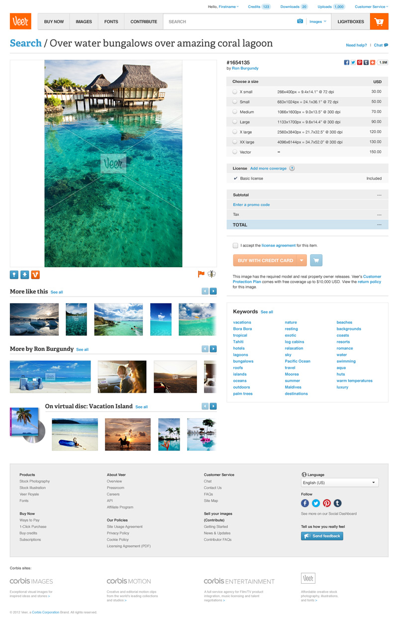
The product page I designed was intentionally kept familiar and as simple as possible to allow for as much flexibility in product type as possible. Stock images were the simplest version but I wanted to provide as much value with the page as possible so I included some additions below the image. ‘More Like This’ has been recently adopted in search results and was pretty standard practice on other product pages I’d seen. With the new version we were looking to highlight more of the community aspect by highlighting photographers so that made sense as well. Finally, the first version of Veer identified when an image was part of a ‘disc’ but I suggested taking it a step further and included a filmstrip as an upsell.

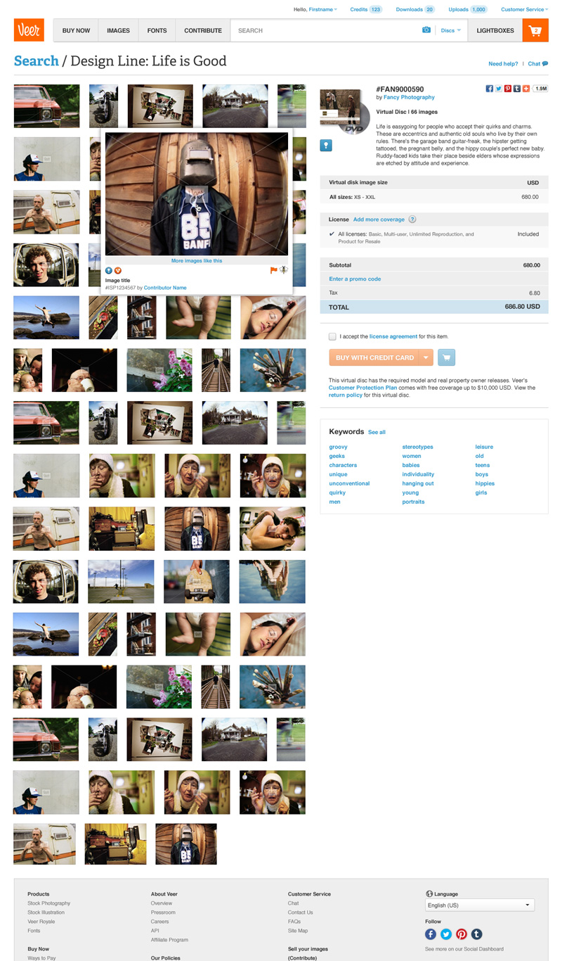
Image collections were our least purchases product but provided enough value that knew we wanted keep them in the new version. On hover, the images could still be purchased individually or used to run additional searches. The image collections never reached into the hundreds so I suggested that we represent the collection in full as an image grid.
At the same time I was working on the product details, another designer was working on the modal purchase path which would be used to purchase images quickly and directly from places like search results. To avoid rework or conflicting functionality, I held off working on the purchase section of this page until we had the opportunity to collaborate and implement what she had already tested and refined from her work.

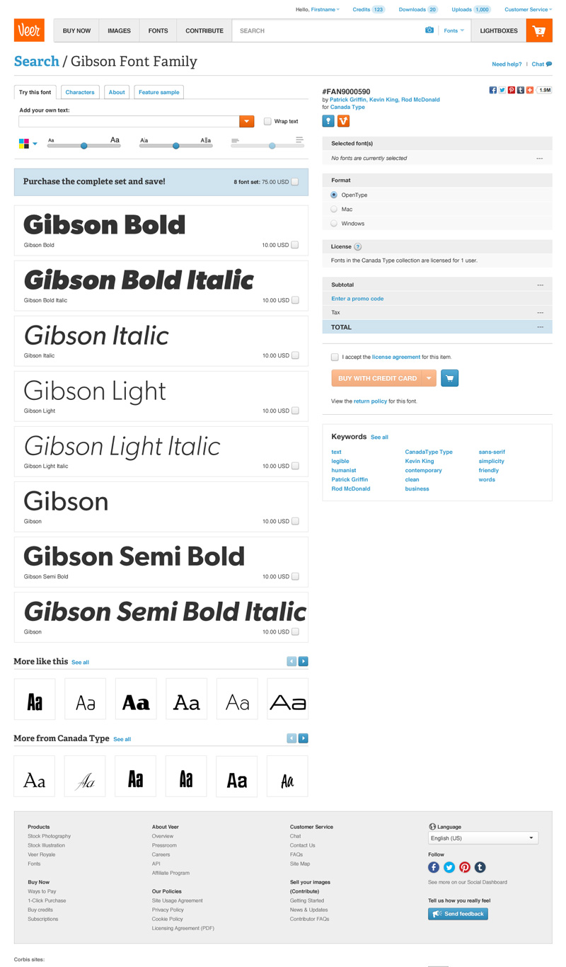
Font families were nothing new to Veer either, however I suggested some refinements in our functionality for testing the font. In addition I suggested we implement the ‘More Like This’ functionality here as well and include a new film strip for the font creator to support our community initiatives.
Additional Thoughts
Up to this point I had worked on several projects making updates and refinements to our product pages but this was the first time I had designed a product page in full. It wasn’t a particularly challenging project from a problem solving perspective, however it was a pretty engaging one and I loved working within the Veer brand. The final product was a very clean, consistent and navigable page that I’m proud to have designed.
Many thanks to the following teammates for their collaboration throughout this project:
- Christina Nghiem