Veer: My Account
When our design team took over the redesign of our Veer product I was tasked with several parts of the site. When I began working on the ‘My Account’ section of the site I was asked to mentor our intern at the time so I divvied up the initial design work between us: I worked on the Orders, Credits and Subscriptions pages while he focused on the Profile page. After his internship was complete I followed up with refinements, errors and alternate states to complete the design of the section.
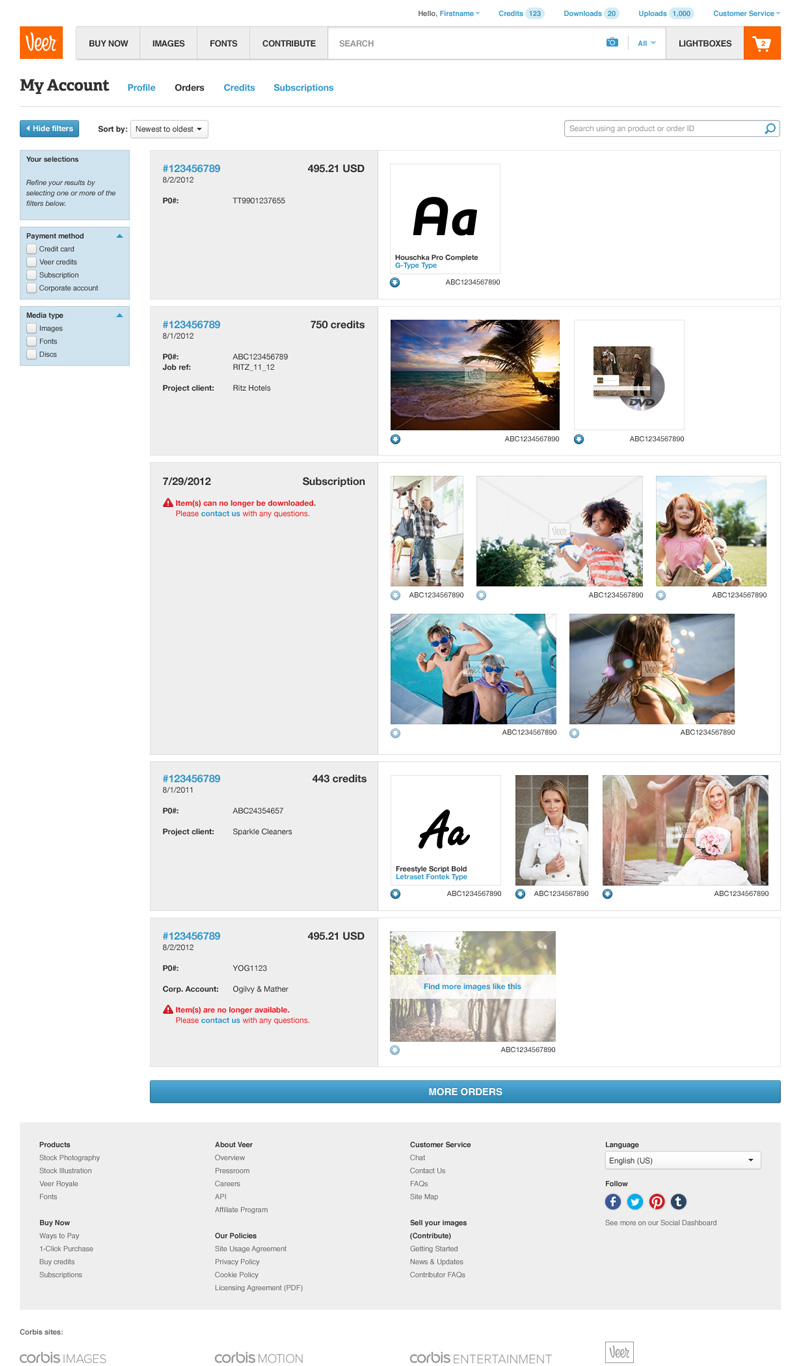
The orders section of the site was straightforward for the most part. Most of the thinking went into making the orders easy to navigate and parse through. That said there were some alternative states to be considered, namely items no longer available for purchase and items purchased with an expired subscription. For the former, I suggested using our ‘More Like This’ functionality to provide a positive direction for the user.
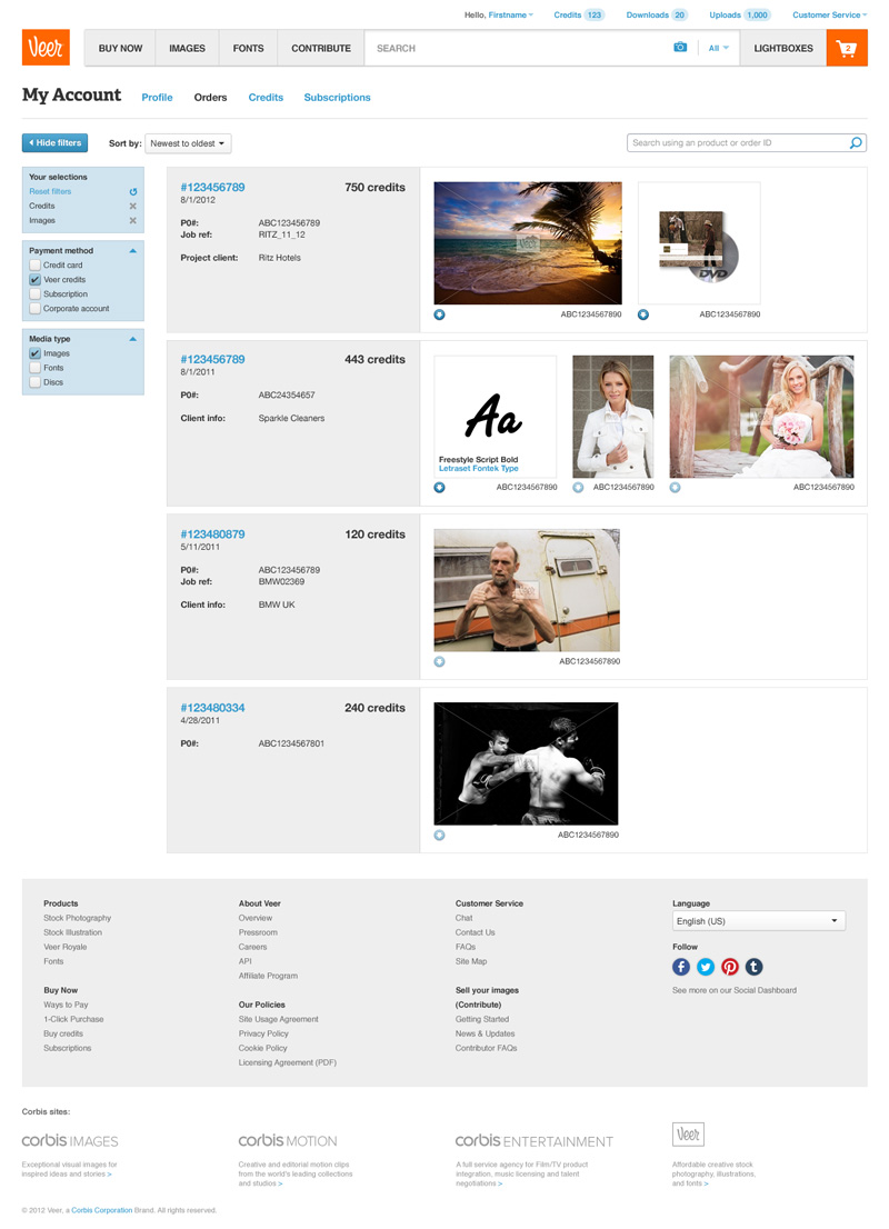
There were a number of ways to filter and sort the orders. Initially it may seem like overkill but after researching the number of orders in some customer accounts we realized it would be very beneficial to give them some options. In retrospect I think more options around timeframe might have been prudent especially because of our infinite scroll pagination.
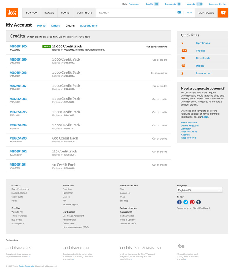
In prior iterations of the product credits were listed in with the orders. I suggested providing them their own page to allow for a more focused and uncluttered orders page. The orders page simply listed the details of the Credits purchases as well as the state of the credit pack: active, depleted or expired.
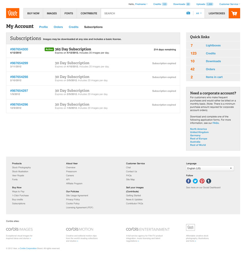
Subscriptions were a new option included with the launch of the site and were given a very similar treatment as credit purchases. Subscriptions did not have a depleted state in the My Account section as it would refresh every day and would be reflected in the purchase path of the items.
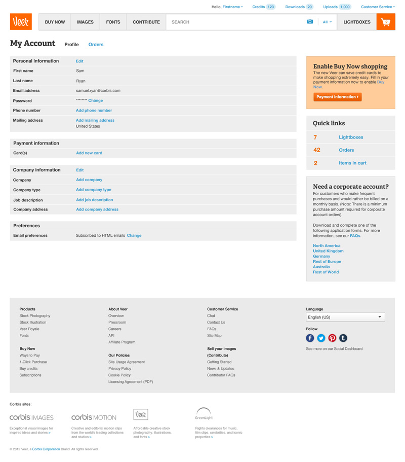
My initial involvement for the Profile page was strictly feedback as I mentored our intern through his work on the project. After he completed his internship I took over the refinement and addition work on this page and it’s subpages but stayed as true to his original work anywhere I could. The screenshot shown is of an account with minimum details, typically just after account creation. Additional details would be populated as the user interacted with the site.
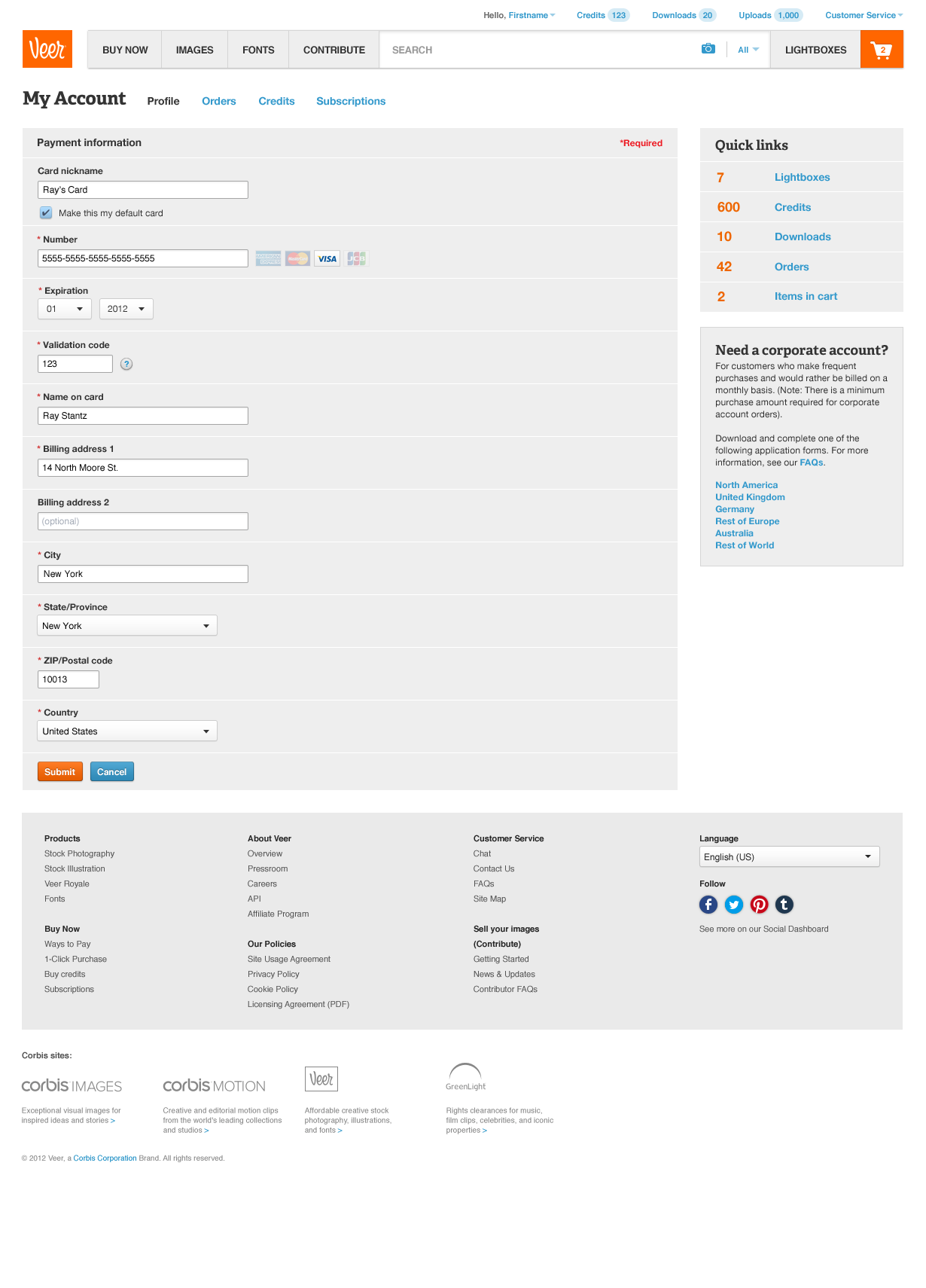
The credit card form was kept in line with the form used in the purchase path with the exception of the additional ‘Card nickname’ and ‘Make this my default card’ fields. If I had designed the page at the time I likely would have used modal layers on the profile rather than subpages, however I respected our intern’s direction and decision to use subpages for editing each profile section.
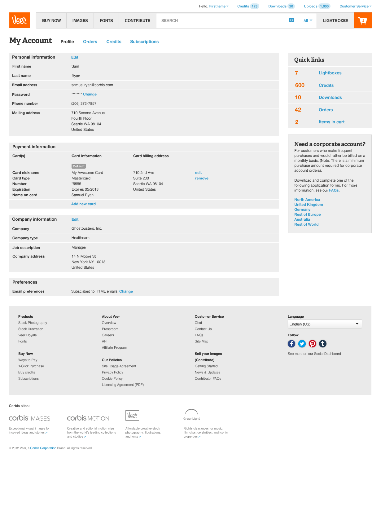
The profile shown is for a customer with all fields completed. The Buy Now call to action was removed after adding a valid credit or debit card. Company information was optional and strictly utilized to better understand our customer demographics.
Additional Thoughts
This project was a fairly straightforward, no-nonsense one but it was the first time I had mentored another designer on a project. He was a thoughtful designer with a lot of good ideas and motivation, making it easy to keep him going. That said he was young and idealistic (not a bad thing) so the real challenge was keeping him grounded without stifling his creativity, especially on such a pragmatic section of the site. Thankfully, I think we both learned from the experience and we developed a good working relationship.
Many thanks to the following teammates for their collaboration throughout this project:
- Sam Ryan
- Christina Nghiem