Moz Pattern Library
I began developing Moz’s Pattern Library as a direct result of our ‘Brand Exploration’ project which looked across all of our products and properties to identify inconsistencies in our user experience and brand aesthetic. It utilized a thorough set of guidelines created by Derric Wise (Moz’s Art Director) and was vetted through regularly scheduled reviews with key stakeholders from across the company. The first version of the pattern library, which focused on basic UI was designed and distributed as quickly as possible via PDF as we knew implementation across our products would be slow and iterative. Later versions were intended to include larger, more complex patterns and to live as part of the UX team site as an open online resource after the site MVP was launched and active.
Something important to note is that even in PDF form, the patterns were updated often to reflect iterative changes based on testing and feedback and those updates were done by several team members. In order to avoid taking credit for someone else’s hard work I’ve only shown the initial version I published in March of 2015. I’ve only included a handful of screenshots with descriptions, however a full version of the PDF is available at the bottom.
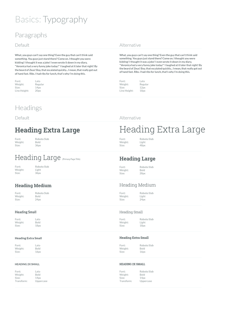
Typography was one of the more contentious parts of the project as it had to meet requirements for both readability and general aesthetic. In addition our developers required that we minimize impact to page load as well as requested that the relative sizes between fonts in our stack were as close as possible. After a lot of testing we landed on Roboto Slab for headings and Lato for copy. At the time our existing properties used a third display font which we removed altogether to meet our loading requirements. The sizes shown were specifically selected for use in our products, however the base ‘EM’ unit was bumped up to support larger all around font sizes for our marketing, help, and community areas.

Links, like many parts of the project were iterated on as we implemented, tested and processed feedback from users. It was eventually decided to update the link font color to provide more contrast with the background. In addition we added underlines to all links based on W3C guidelines. Lists and tags were also included and iterated on to ensure readability.
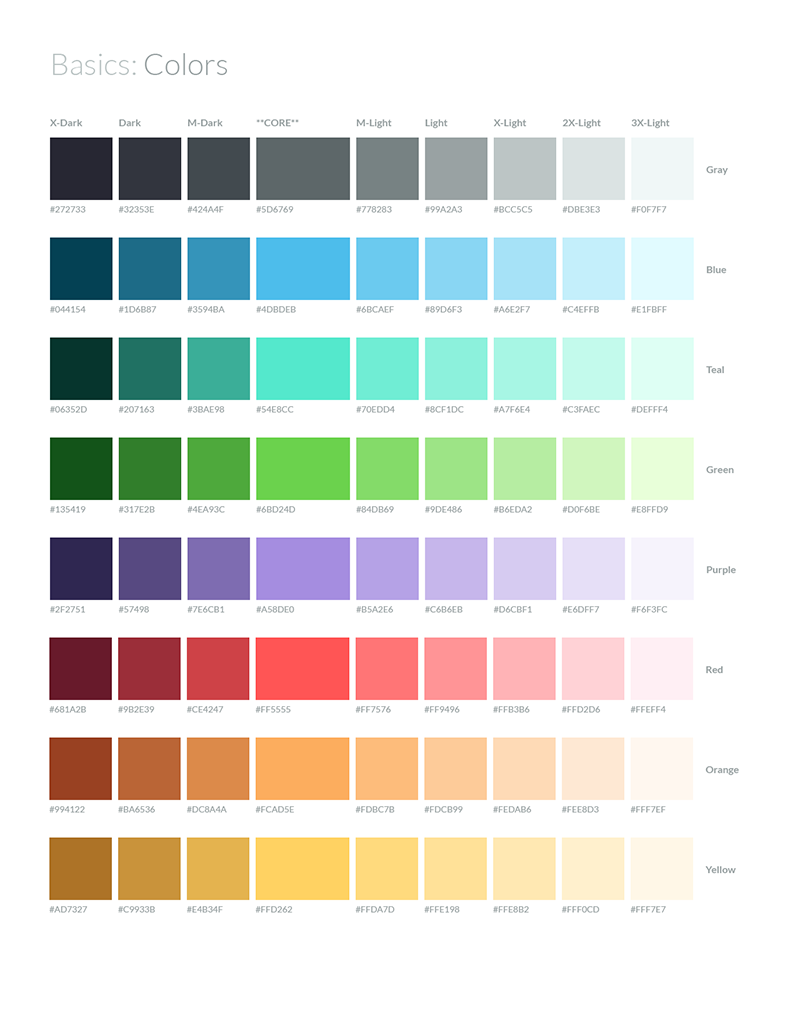
The initial selection of brand colors was done by our Art Director to which I did a small amount of follow-up tweaks before implementation. As part of implementation, I worked with a developer to define a language for the color names and gradients to ensure we had consistent language across departments and products.
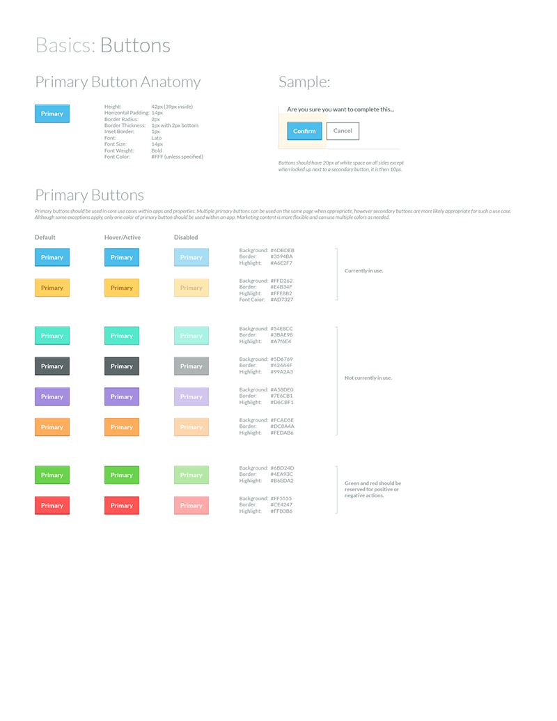
Buttons we another place of particular contention as we had an incredible number of variations across our existing products and properties. In addition, this was another place where our developers had asked us to pare down. We landed on 2 variations: primary and secondary (not shown.) In addition we had a alternative larger size for primary buttons for use in marketing CTAs as per feedback from our marketing department. In the end we kept to a fairly simple style, that we felt looked as at home in an application interface as it did within our community and marketing properties. Although there was some continued back and forth on the aesthetic, subsequent updates were based on feedback and focused on improved readability.
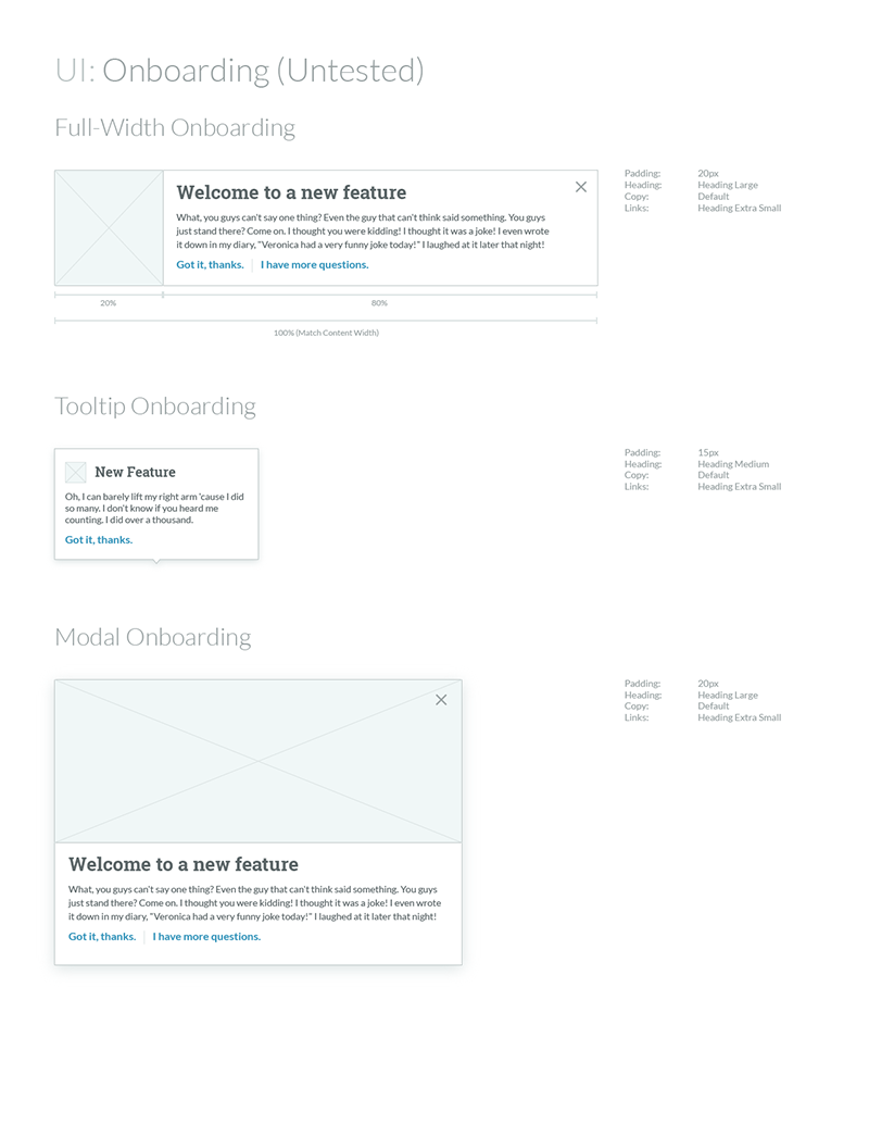
As implicated in the screenshot this was somewhat uncharted territory for us. To this point every product had wildly different on-boarding if at all. I was really just taking a stab at some unified designs based on the various patterns we’d researched. They were eventually implemented in our products and were successful to varying degrees however further testing and refinement did not happen while I was still with Moz.
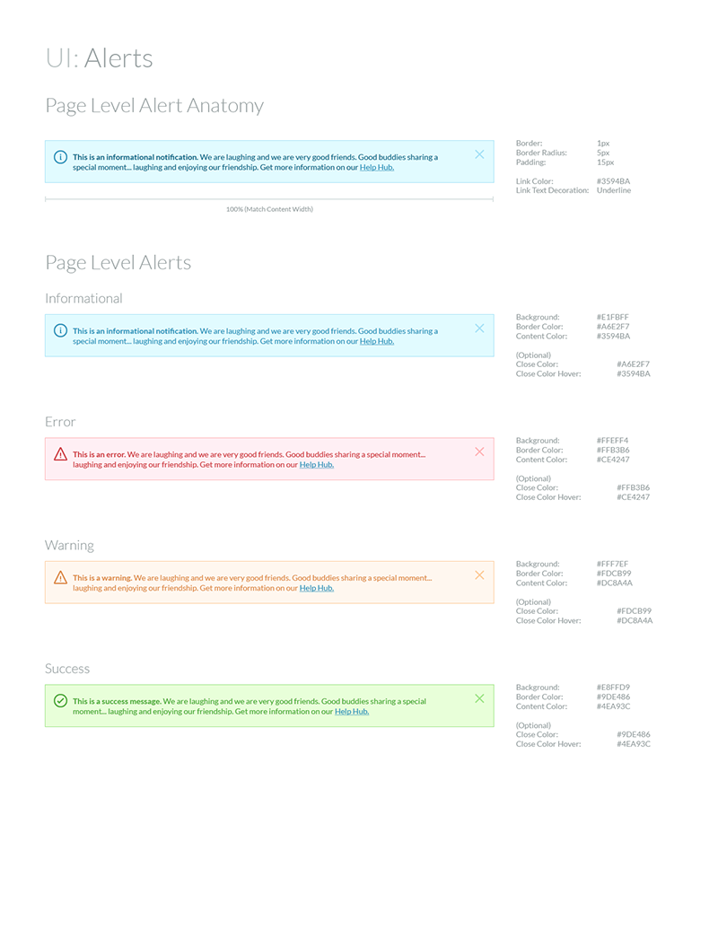
The lion-share of patterns were designed, reviewed, and implemented with only minor tweaks. Alerts across our existing products and properties were varied but people were pretty happy with the suggested pattern. After implementation, feedback was positive and they were among several patterns that required little or no iteration.
Additional Thoughts
While I couldn’t justify including the full pattern library I have made it available in PDF form below. As with most projects, I learned a lot through this project and it definitely helped me grow as a designer. I find that I’ve become more and more passionate about creating structure and organization around my design work and this project was really engaging for me. In addition, I had the opportunity to facilitate discussions across teams and departments, identifying issues and finding compromises to keep our momentum going. It was a lot of work and difficult at times but in the end we had a library of comprehensive patterns to align Moz’s design language and iterate on as we continued to implement, test, and refine.