Hawaiian Humane Society Website
When we set out to build a new website for the Hawaiian Humane Society, our Revacomm team began with a thorough discovery process and almost immediately a couple of things became very apparent. First, the existing website had a very robust library of content and integrations which we would need to continue to support. Secondly, prioritizing and simplifying site navigation was going to be one of biggest challenges, but necessary to create a sensible, intuitive interface. This was my first project at Revacomm where I lead both the design and front-end development, while working with 3 full-time developers to implement the necessary integrations as seamlessly as possible.

As with most marketing-driven homepages, our goal was to provide as few clicks as possible for users to access the workflow they needed and because we had simplified the navigation to a handful of key categories and features, prioritization of those contextual links became that much more important. Initially, we began the project giving more weight to user needs such as adoptions and services. However, as time went on we realized that with the turnover in adoptions, users would have no problem finding those features even if they weren’t front and center, and so we pivoted our focus to the needs of the organization.

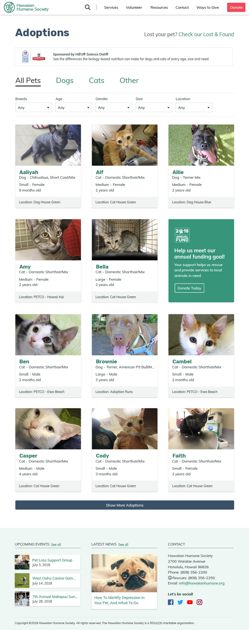
While donations and volunteers were a priority for the organization, we knew we had an opportunity to improve the adoptions page by adding a number of filters that would dynamically adjust depending on why category of animal you were looking for. In addition, the HHS has requested we add a couple of ad spaces on the page: one for sponsors at the top, and a second for promoting internal promotion which would appear randomly at intervals within the results.

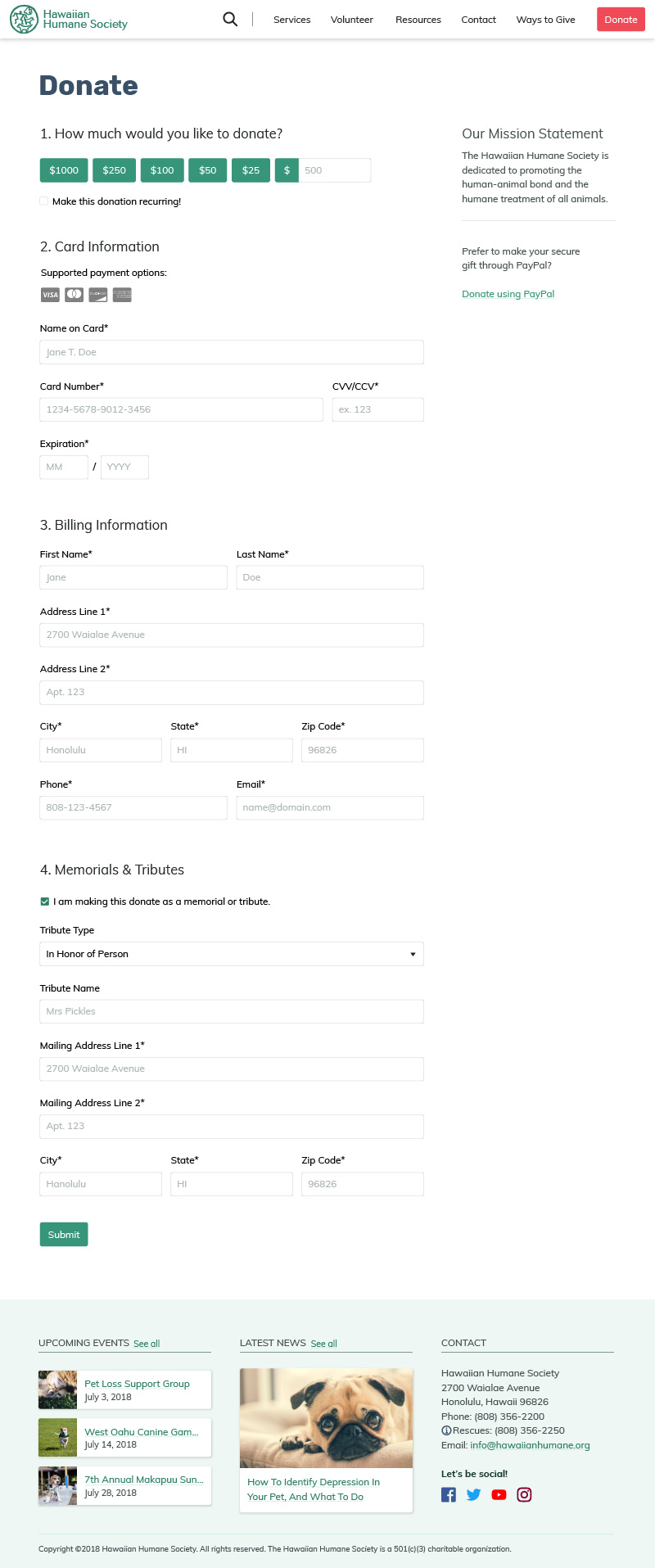
Just one example of the various forms found on the HHS website, the donate page required its own integration to provide for both checkout and uniquely, a tribute functionality. Because of the number of integrations on the website, and the varying nature of them, we were especially careful to style all of the integrations as closely as possible to avoid confusion or mistrust.

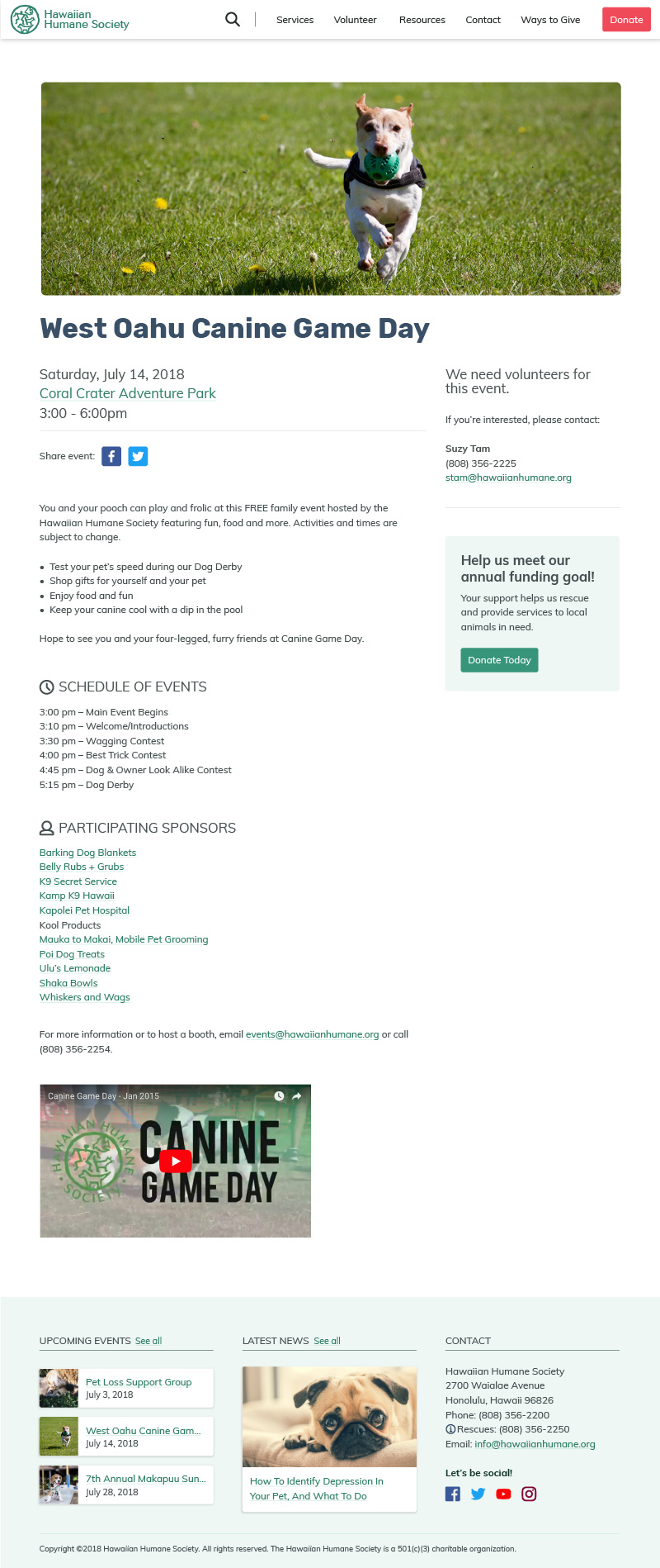
As an agency, one of the biggest challenges is working within limited budgets and this project was no exception. While the original site had around 1,500 pages with varying content types one of those challenges was that we had to create a template that could be used for many different types of content by modularizing anything that wasn’t included across all types. Shown is an event with modules for event details, volunteer information, and donation ad space.
Additional Thoughts
While this project seemed simple at the start, the real challenge became how to create a consistent, intuitive experience even with the number of integrations and volume of content. In the end I believe we were successful even given our limited budget and I’m grateful for the lessons learned. However, though the website was completed, it did not launch prior to my departure from Revacomm due to the forced resignation of leadership at the Hawaiian Humane Society amidst an ethics investigation. My hope is that the site will still launch eventually, as the organization had some really great people and I wholeheartedly enjoyed working with them.