Moz Followerwonk: Version 2
Followerwonk is a Moz product that allows users to analyze their Twitter accounts to better understand their growth and potential. The first version of the tool was developed over the course of several years by a very small team without much oversight. The tool was useful but without an overarching structure workflows were confusing and with some data limitations it handcuffed many of the users who were most interested in using it. In addition maintaining the site had become very time-consuming. In the end, it was decided to launch a new version of the tool and I was moved from the Keyword Explorer project to Followerwonk to lead it’s design from the ground up.
Planning and Restructuring
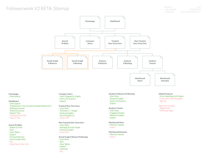
While it may not be the most interesting of screenshots one of the most important pieces of the redesign was restructuring the tool and providing better workflows. Once I had established this sitemap and high-level feature list it was updated regularly and used in planning meetings to help visualize our progress and inform next steps.
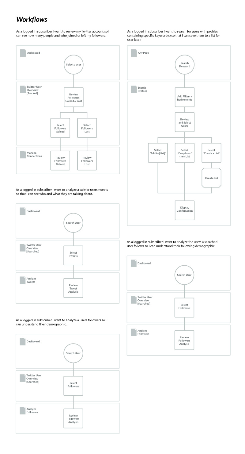
In addition to creating and updating an overall sitemap throughout the project, existing and improved workflows were documented to validate our restructuring of the product. This was especially important because we were relying heavily on a contextual rather than traditional navigation. The workflows shown here are some of the basic functionality on the dashboard and omni-search.
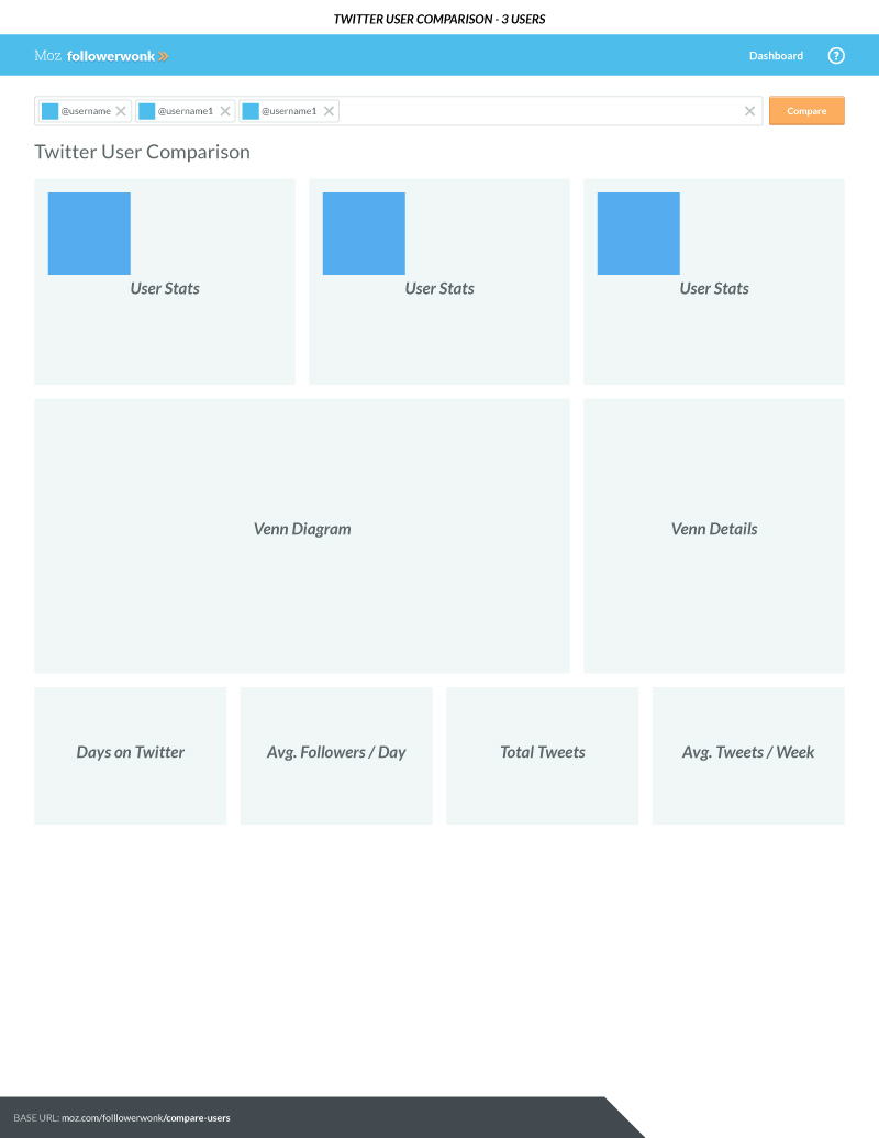
Inevitably I use a lot of wireframes on projects but I utilized them heavily on this project in particular. Because we were restructuring the project we needed to validate and adjust workflows and navigation quickly. The wireframe shown represented our user comparison page and ended up being pretty accurate to the end product shown in screenshot 9.
Final Designs for MVP
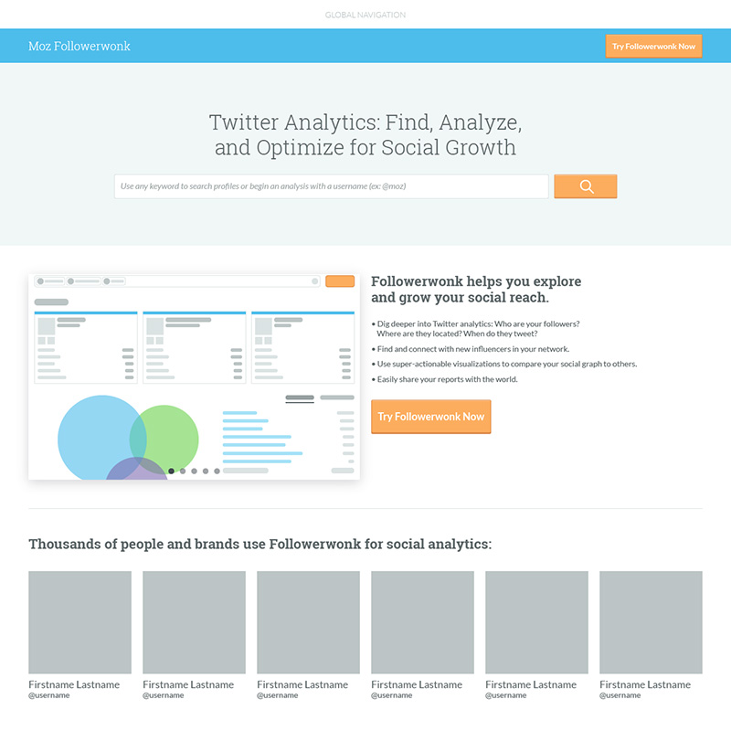
In keeping with Moz taxonomy and structure for our tools the landing page for the product was kept simple providing a single search bar for first time users. This however was our first introduction to using a search bar that provided a contextual experience depending on what you searched; search for a keyword term or phrase and the results were a list of users with profiles containing the keywords, search a @username and it provided an overview for the specific user.
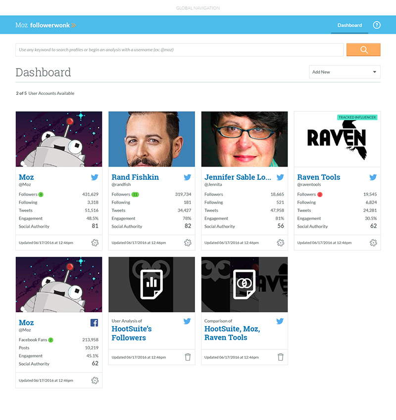
The dashboard was quickly becoming a prominent navigational and analytical tool across Moz’s products. In overhauling the tool we had the opportunity to restructure it providing better workflows and a more consistent experience across our tools. This dashboard was unique however, in that it created a very flat and upfront navigation between saved reports and lists as well as tracked users. In initial user testing it did very well and our intention was to further prove (or disprove) the concept with the launch of our beta. This page also served as place to manage reports, lists, and users with long-term plans of adding functionality to manage access for multi-seat users.
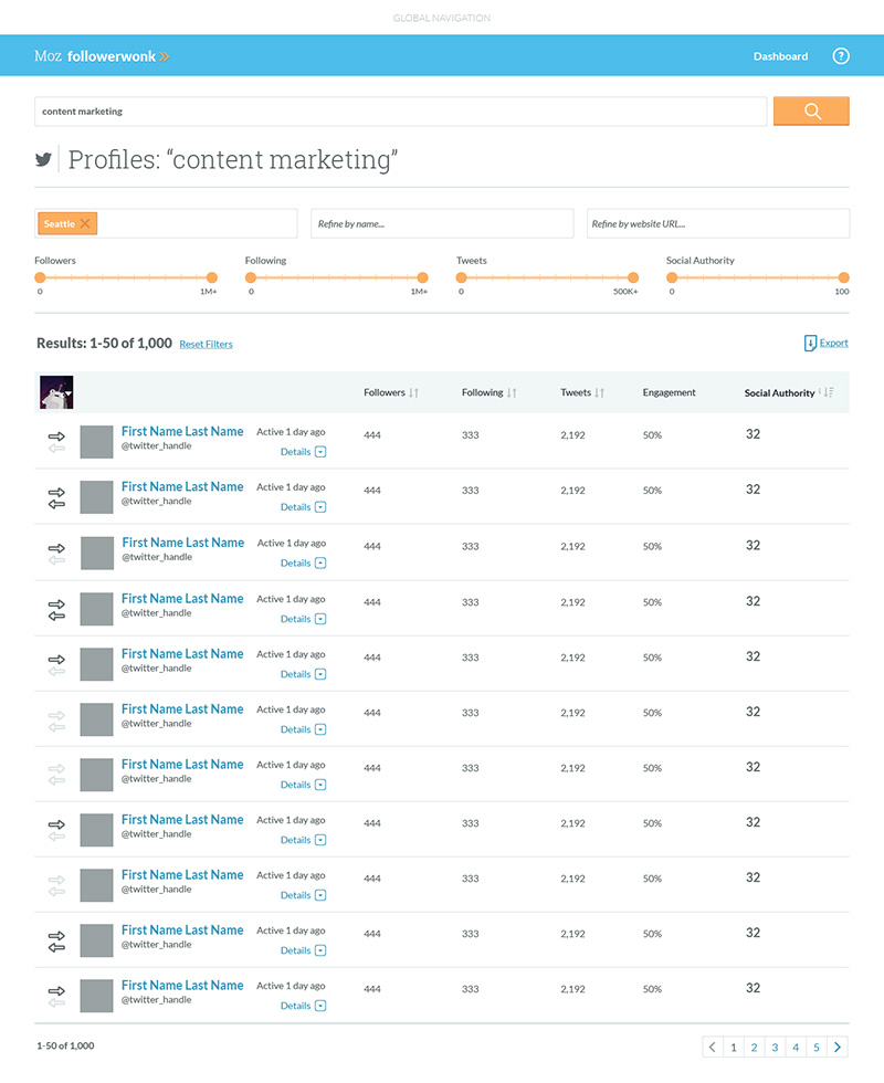
This page appears when a user searches using a keyword term or phrase from anywhere in the product. It returns a list of users with profiles containing the searched keywords along with high level stats. If the user has authenticated one or more Twitter accounts they can select between them to review social graph information as well. Filters can be used to further refine the results which can then be sorted. Exporting to a CSV was part of the initial launch to keep parity with the existing tool, however further plans to generate and manage lists within the tool were on the roadmap with high-level designs in place. Each result can also be expanded to see more profile details or selected to do a full analysis.
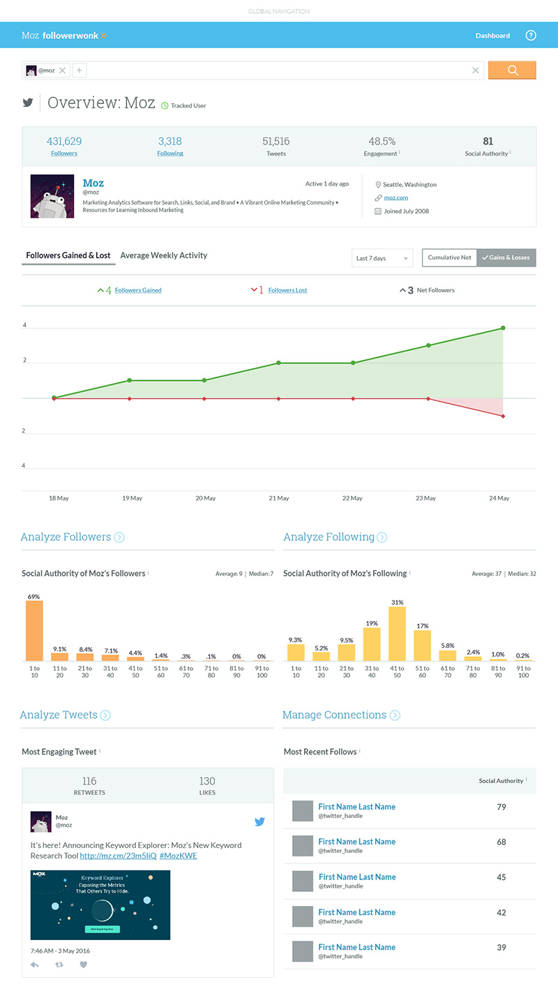
Tracking users allowed for a deeper analysis through tracked statistics such as users gained and lost, shown as the top featured graph on the page. I did explore some addition data visualizations including an ‘Amplification’ graph which displayed a users recent activity on a timeline with peaks and valleys based on engagement. Ultimately data visualizations outside of parity with the existing product were placed on hold until after it’s BETA release.
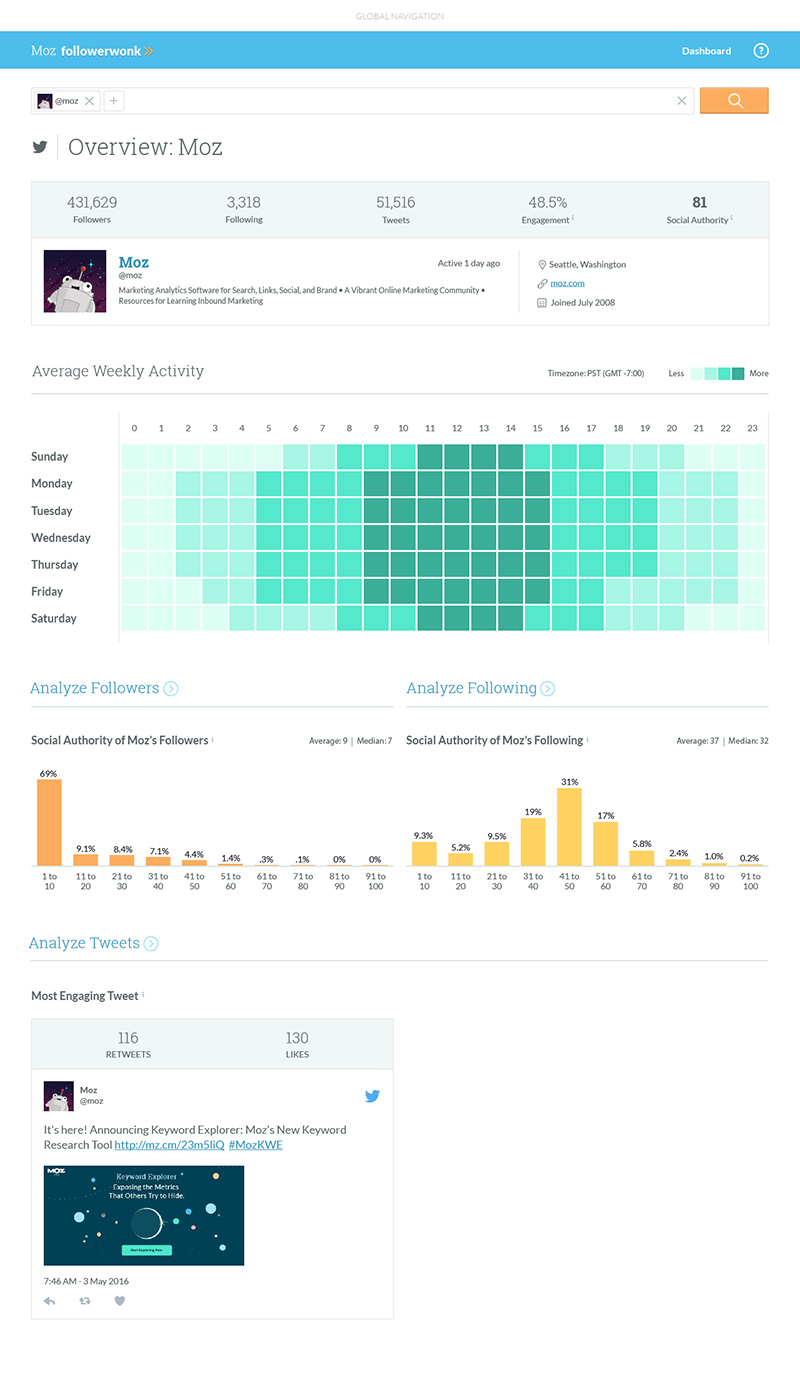
The user overview was a new page introduced to provide high-level analysis as well as contextual navigation for deeper user analysis. This version of the page is displaying an untracked user and focused on their overall stats and recent activity. Foremost on the page, the Average Weekly Activity graph was generated using their latest 5,000 tweets to determine their most active times.
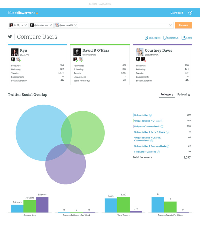
User comparison was a very unique feature of the original product but was underutilized due to data limitations and poor navigation structure. With the update, users could very simply add a second and third user to the search bar from any overview or analysis page and jump immediately into a comparison. The content of page itself did not change very much, however much of the page organization and language was adjust to better clarify the data.

This page was one of the earliest and most powerful sections of the original tool, however it had a limitation which also make it one of user’s greatest sources of frustration; if the user’s social graph (number of followers and following) was too big it would throw an error and the page would be inaccessible. The development team had made several attempts to optimize and provide access for larger accounts but the issue persisted. It wasn’t until I was redesigning the page that I had an idea; instead of worrying about showing all of a users social graph let’s just adapt the page to use their most recent, something Twitter’s API does by default already. Small accounts could see all of their users while large accounts could view their reports in the context of their most recent followers. As you may notice, possible the data visualizations were pulled inline with the rest of the Moz tools in the effort unify Moz’s products and brand.

The core content of this page didn’t change very much from the original tool however, a lot of work was put in to align it’s visual language with our other tools. One addition was to display the top engaged users for each tweet, which while simple meant some pretty cool opportunities for users. This meant they could easily see which influencers were engaging with their tweets and understand what content they engaged with, informing them on what type of content they should focus on or avoid to continue growing their social graph.
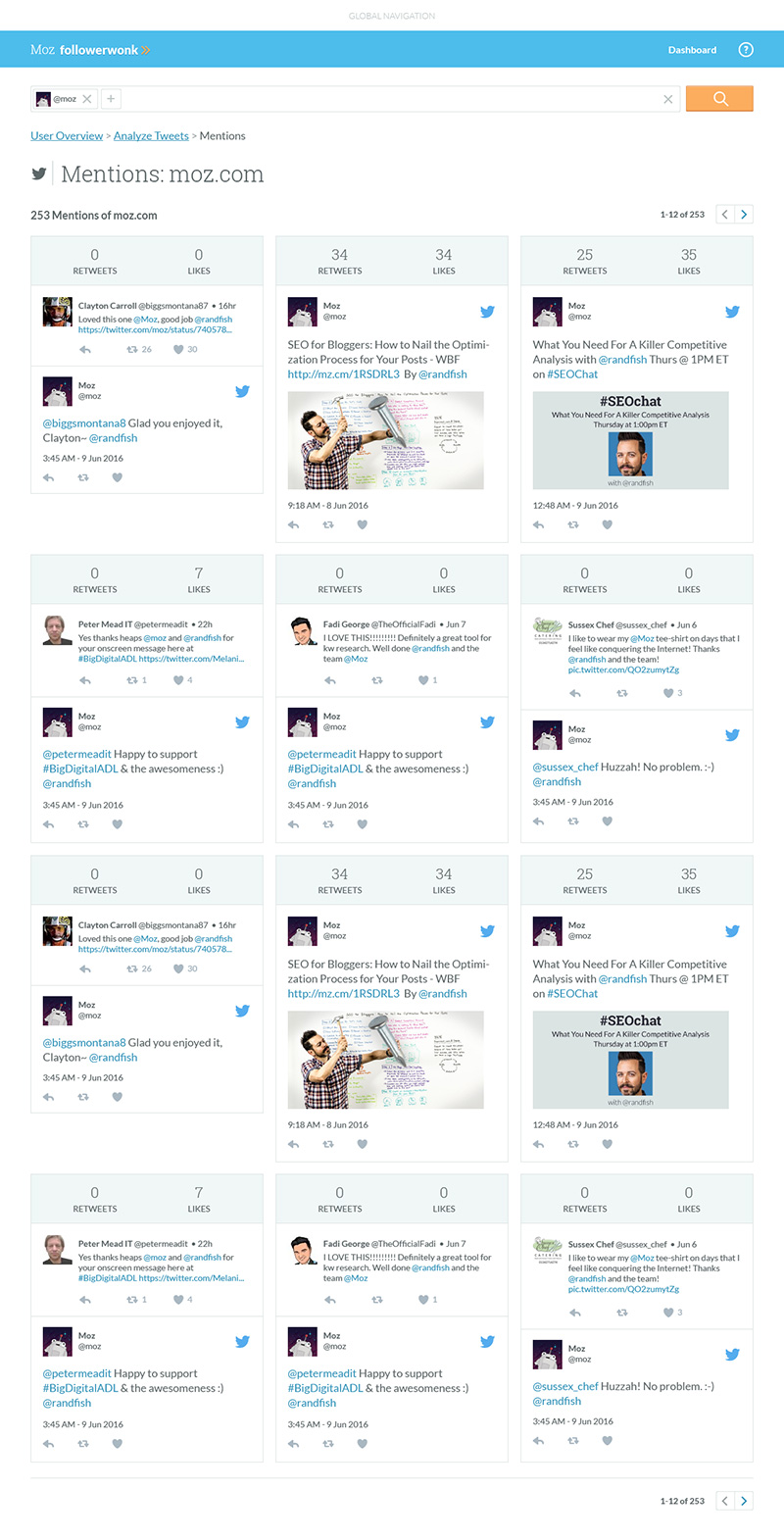
The Mentions page is a sub-page of User Analysis and it allows users to further explore tweets mentioning a specific user, tracked or otherwise. While not often utilized it could be a useful tool to identify additional influencers but there were debates whether it was a valuable page to improve and maintain long-term. It the end was kept in as part of reaching parity with the existing tool.
Additional Thoughts
As with other projects there was a ton more documentation regarding alternate states, notifications, settings, and much more as well as planned features I am not able to include because the project was indefinitely postponed. Less than 6 weeks before launch of the beta, with an alpha already functional the company reorganized and funding to all but a few core products was cut. A third of the company was laid off and the Followerwonk team was no exception. The original product is still maintained and in-use today albeit with all of it’s workflow issues and complex data limits. In the long-term, even though I might not be part of it, I really hope that version 2 is launched someday. There was still a long roadmap for to product to be all that it could be but the response to initial user tests was very positive and I’m confident even the beta product could make a big difference in the day-to-day for a lot of Moz users.