Branded Entertainment Network
The Branded Entertainment Network was the first product I had the opportunity to lead design efforts from it’s early stages up to launch and continued refinements after. It was a real challenge as I hadn’t done much information architecture to that point. Thankfully though it was a fairly simple product which focused on 2 workflows: creating a media plan and reviewing subsequent reports. The product connected companies to find and connect with opportunities to place their products into movies and television shows, digital media, music video, and even celebrity appearances to advertise their product.
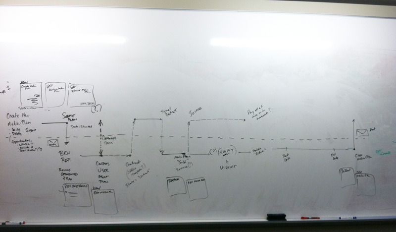
While the architecture of the product was fairly simple, the workflows behind it were anything but. At the beginning of the project their was a lot of discussion and planning to distill what was (at the time) a very nuanced and complex offline process into an optimized digital process. Through those we determined some of the process in the product’s early phases would still need to remain human interactions. After several sessions the product owner and myself sketched this workflow which represented both the online and offline work needed to get a media plan from creation to completion.
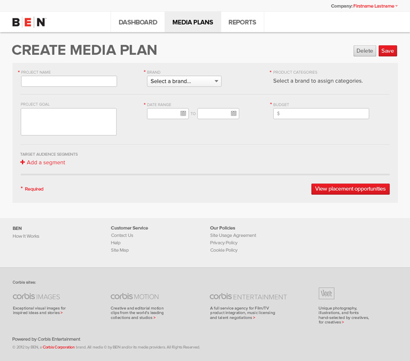
The whole process began with the customer creating an initial media plan. Primarily our customers were agencies representing multiple brands so this was a pretty big consideration.
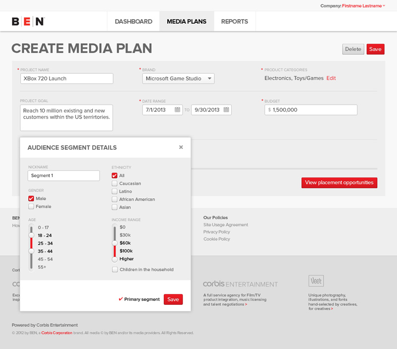
Defining segments was one of the best sources of information for us so we tried to simplify it as much as possible. It helped to provide more accurate search results in the product and further educated our offline processes as well. As such this was by far one of the more heavily tested and refined parts of the project.
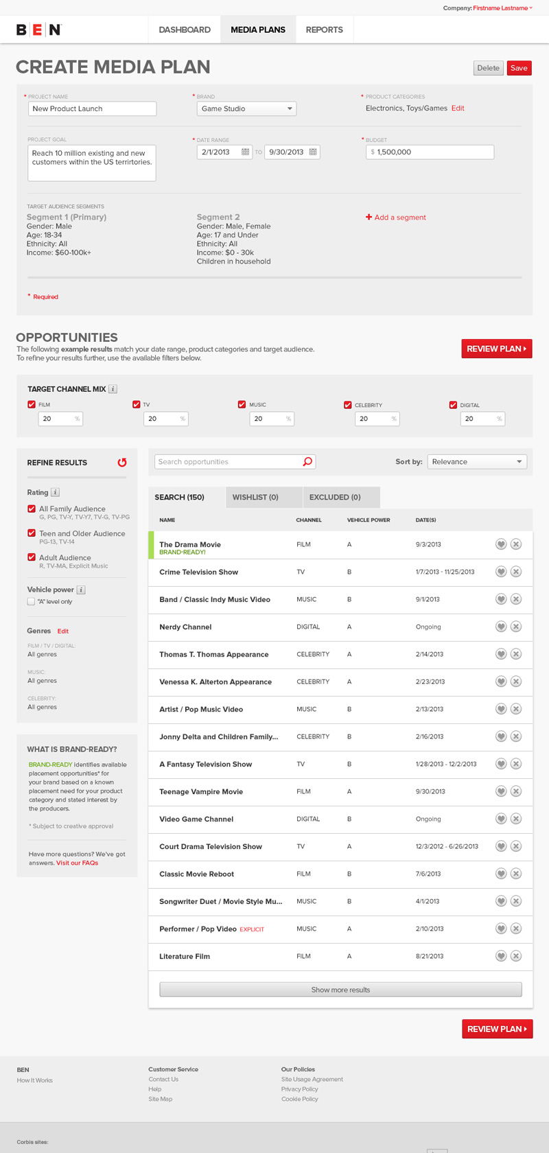
After entering most of the details for the media plan the customer was then able to select the channels they were interested in as well as the weight of the channels in the plan. In addition, they were provided a tailored list of opportunities to comb through, refine, and ultimately either save for later or exclude from the project.
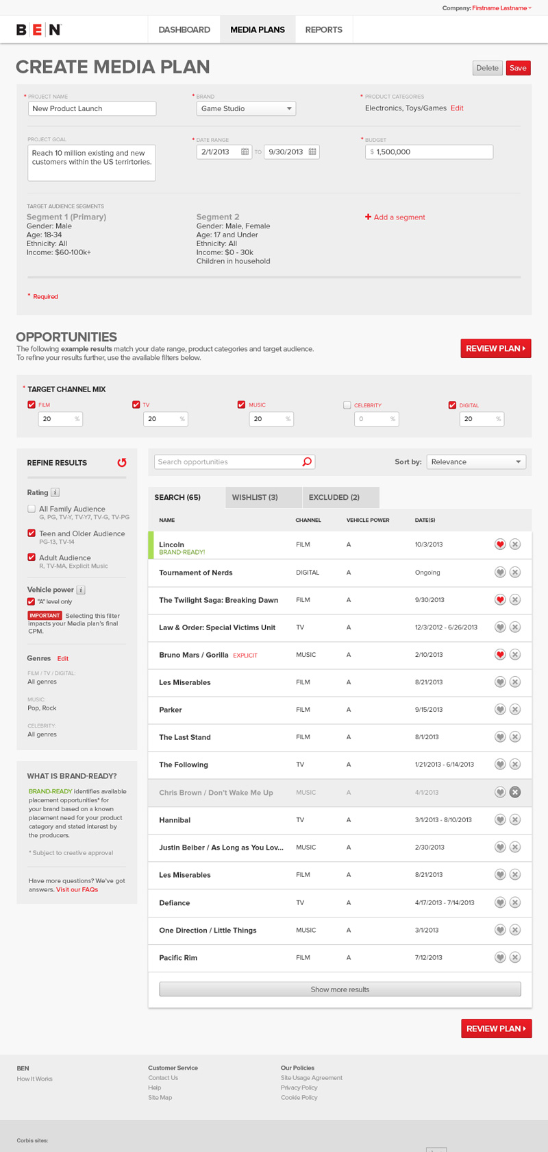
As I mentioned in the introduction, the entertainment and advertising industry is heavily nuanced and we did our very best to simplify. For example different channels had different rating systems or often no rating at all but we knew this was an important refinement for opportunities. After researching, sketching, and lot of paring down we landed on the 3 level option shown: Family, Teen, and Adult audiences.
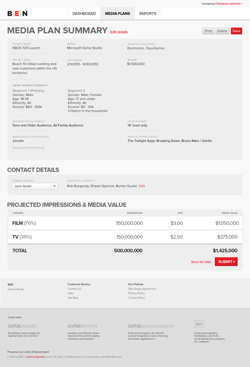
The summary of the plan provided the chance for customers to review and potentially save for later prior to submitting.
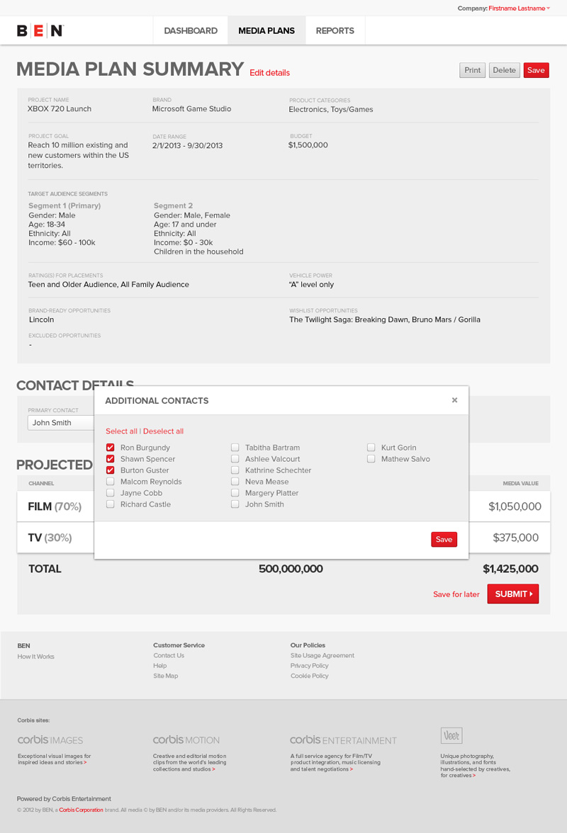
This was another consideration for our agency customers as they often had stakeholders who wanted to be kept in the loop. If selected they would be sent an email with a link to the media plan for review.
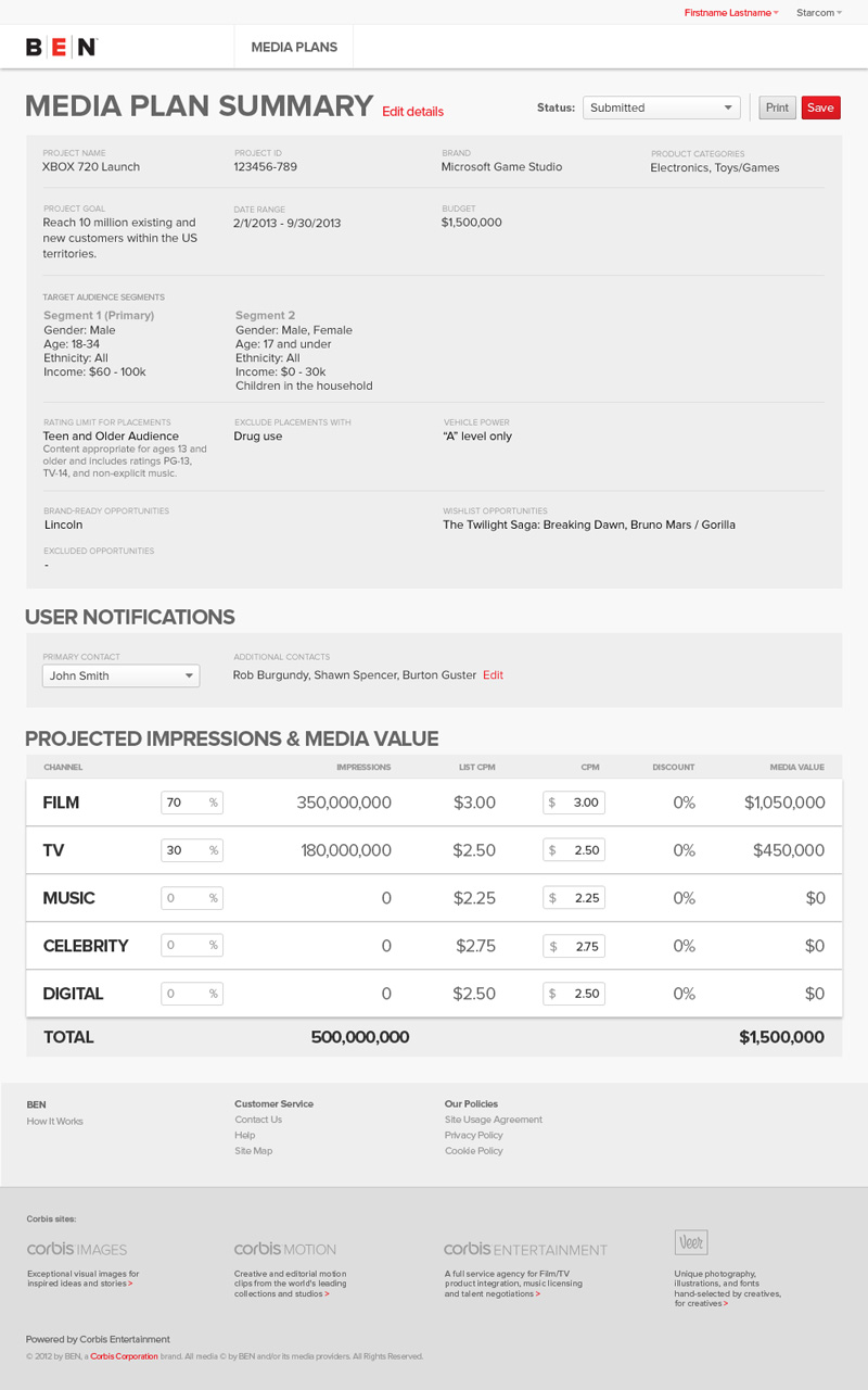
Internally, the media plan summary could be further edited as negotiations in the offline process required. This included the CPM (cost per 1,000 views) which would often be a negotiated value after an media plan was created.
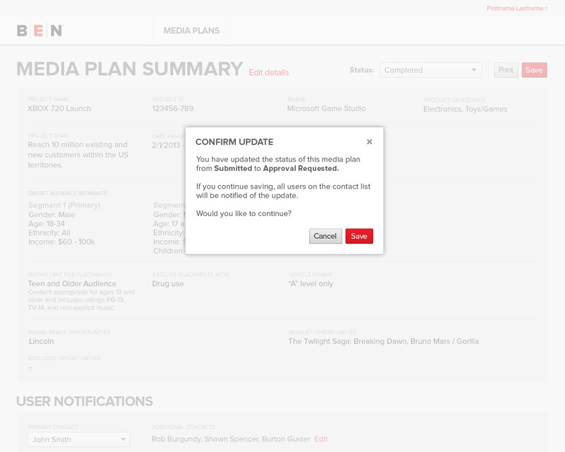
In the interest of transparency, any updates to the media plan required the customers approval but we wanted to minimize spamming our clients. Adding this notification provided enough incentive to minimize changing the plan to often.
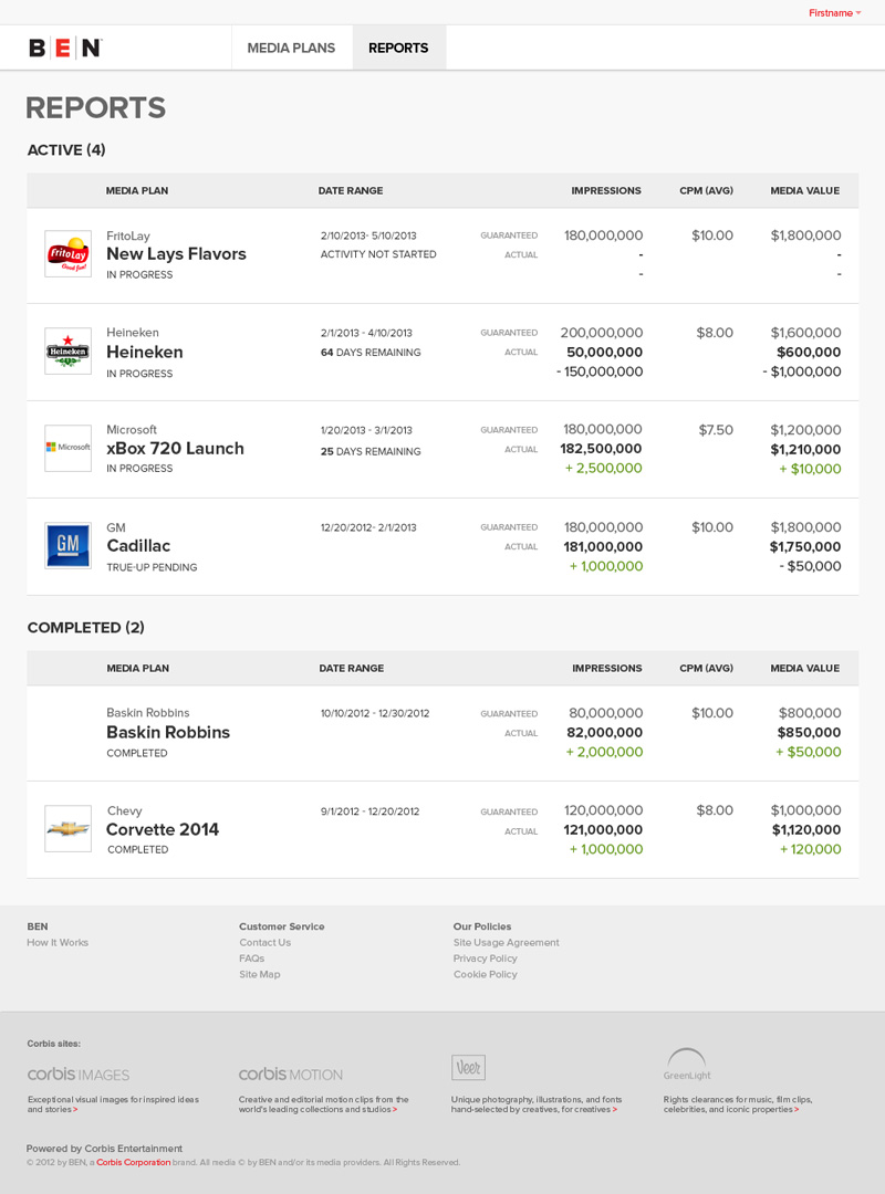
Once media plans were on the move the next thing people wanted to see were reports. The top section of the dashboard contained recently submitted media plans along with reports for media plans in progress while to bottom provided access to reports for completed media plan.
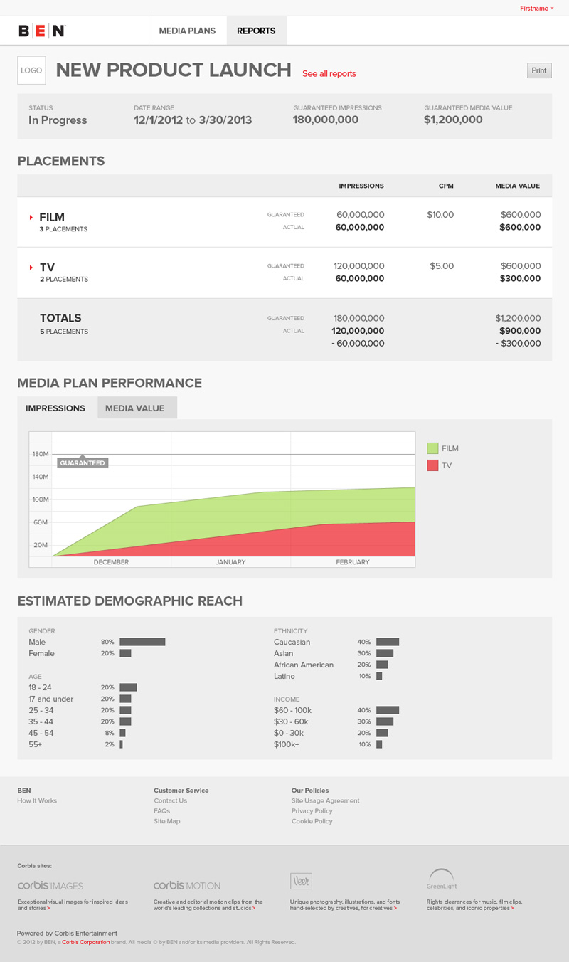
Individual reports provided day-to-day updates on placements as well as impression and demographics information. While the report is very simple in design there was no single entity which provided the information and a lot of work went into coordinating with data providers as well as merging that data to provide such an easily digestible report.
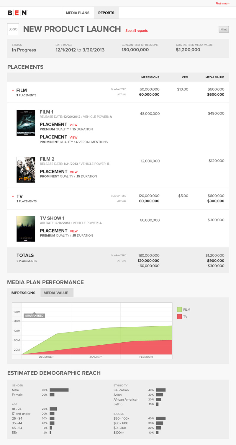
Users could not only access high-level information but we provided individual clips and information for each placement.
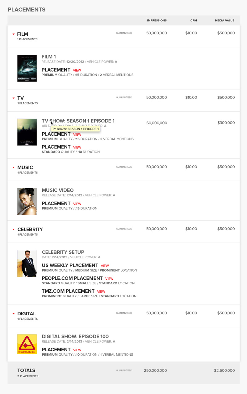
Placements were organized by category and although they spanned various media types I pulled together a standard terminology and design to represent them.
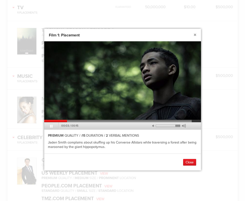
Although these placements spanned various media types we always included either a clip or a photo from the placement as confirmation. It may be easy to take for granted but this often meant employees sifting through magazines, watching hours of TV or taking video at the theatre if the studio didn’t provide a clip. In the end though, it added a ton of value to the report.
Additional Thoughts
This project was an incredible experience for me. Even though I made a lot of mistakes along the way I learned and grew quite a lot as a designer. In addition, it was really fun to see some of the behind the scenes work in the entertainment industry. There were a lot of pitfalls along the way as we were a young and inexperienced team and our stakeholders had little to no experience with technology products but in the end we launched a product that was the first of its kind.
This project was also significant in that I learned the benefits of building solid relationships with my development team. So often I think we can focus on the inevitable arguments and miscommunications. However, after building relationships with them on a more personal level those things happened a lot less. Even when they did happen they weren’t nearly as difficult to navigate.