Zoop App Challenge
This project was part of the interview process with Moz. I was asked to conceptualize and design an application to help Zookeepers with their day-to-day workload. I was told not to spend more than 8 hours on the project regardless of if it was finished and I would present to a group in a subsequent interview. I really ended up having fun with the project and I’m pretty happy with what I was able to accomplish in that time.
The name I went with on the project is a portmanteau of ‘zoo’ and ‘loop’ and the logo was a pretty quick rendering of the idea which incorporates a very simple bespoke font with an infinity loop. As a lot of a zookeepers job revolves around cleaning up animal droppings I included it in a playful way as the loading icon with a fly flying above it in the trademark infinity loop.
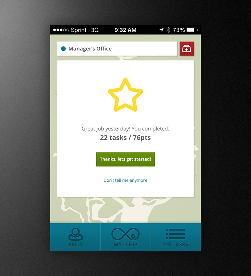
The welcome message appears the first time the app is accessed each day and congratulates the user on the previous days work. Included in the app was a point system which was less about gamification and more about adapting a sort of stripped down agile workflow to help assess workloads and staffing needs over time for park managers – more about that in the ‘Additional Thoughts’ section at the bottom.
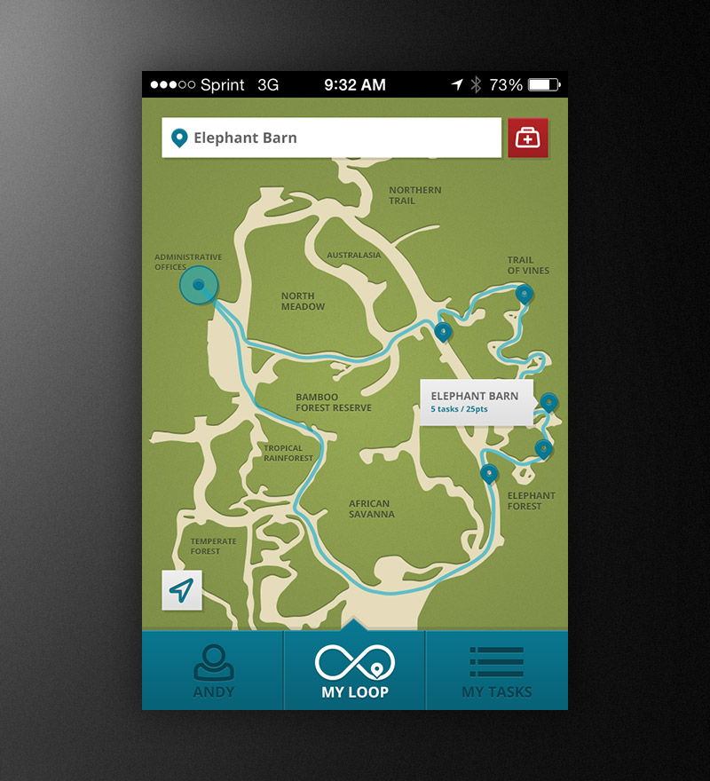
The map screen shows locations for all tasks assigned to the logged in user and provides an efficient route around the park. Tap a location once for abbreviated detail or twice to view the full task list. The selected location is reflected at the top along with a medical emergency button.
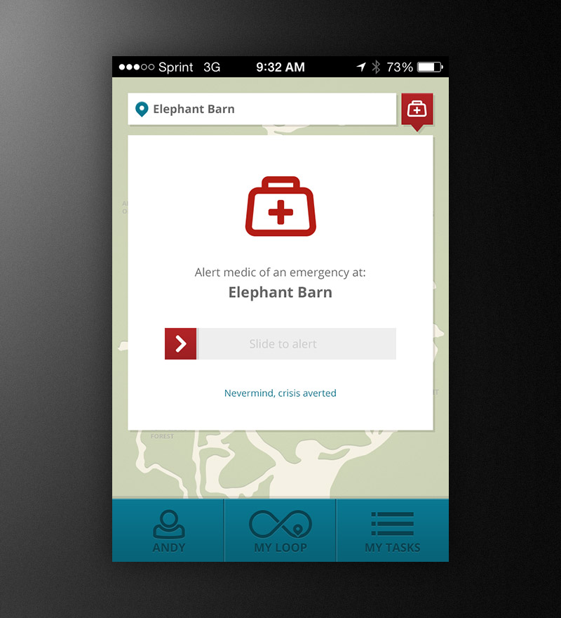
Tapping the emergency button opens the medical emergency dialog which allows the user to alert park staff of an emergency. Once the user slides the control to start the alarm the system sets off an alarm across staff devices causing them to vibrate, generate a high-pitched chirp, flash their lights, and display the location of the employee’s device which set off the alert.
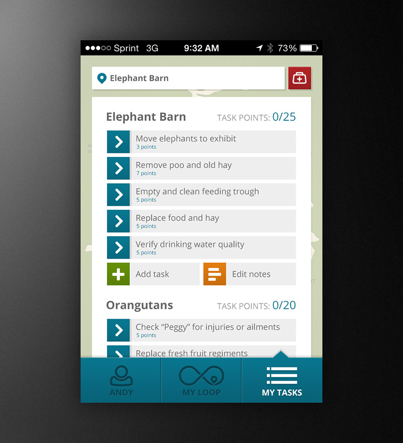
This screen displays the list of tasks assigned to the user for the given shift. The tasks are assigned under a location with point values reflecting how much work the task is. Tasks can be completed in any order and additional one-off tasks can be added as needed. Notes are accessible and editable to recorded any pertinent information.
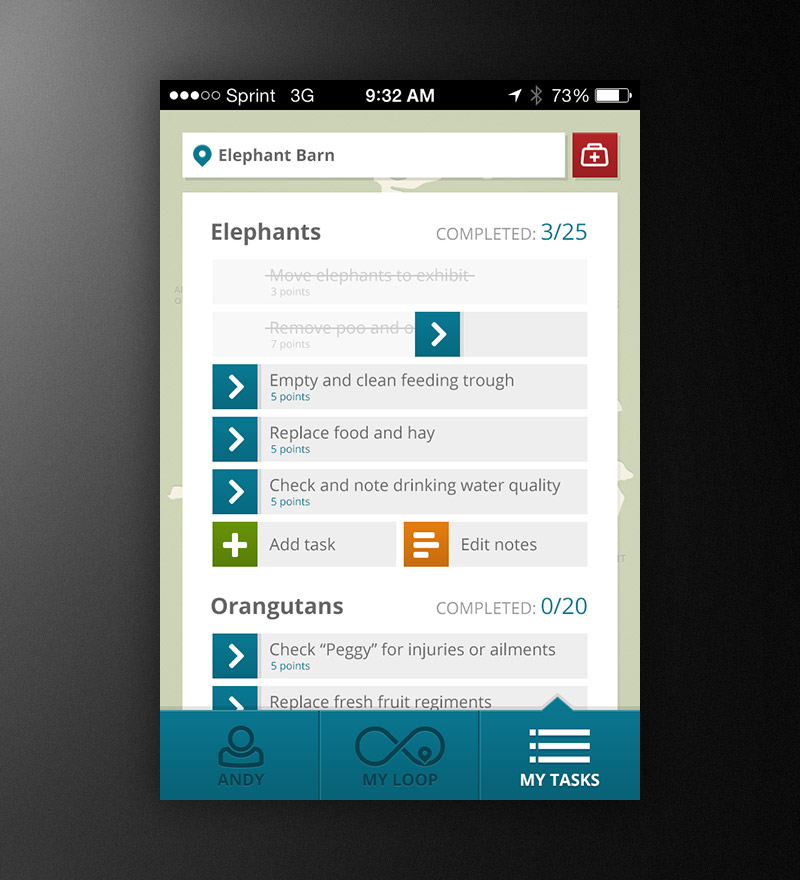
Task completion was designed to be as natural and familiar as possible by utilizing familiar gestures and clearly identifying completed tasks.
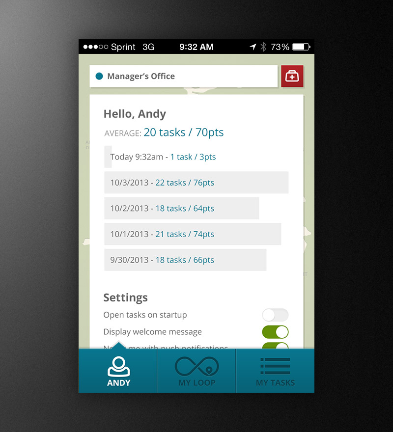
The profile screen displays 5 days worth of task completion history along with settings for the logged-in user. Options allowed users to disable and enable features to further refine their experience. For instance, users who might not find the map useful could default to the task list view.
Addition Thoughts
There was a lot I had sketched up that I was unable to include in the project including an entire administrative section which allowed park managers to add, remove and assign tasks, see the overall workflow of the park, track and manage employees and edit the park map and locations. All-in-all though, I’m still happy with what I was able to get done in the time I had and ultimately I was able to get the job and work with some of the best and talented people I have ever had the pleasure to work with and learn from.