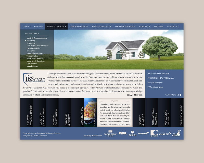
IBS Insurance Website

The logo for IBS Insurance Group was created in two parts: the first was the logo they were asking for which included more detail than I thought necessary and the second was a stripped down logo I suggested in addition to address situations where the larger more detailed logo wouldn’t work due to scale. Both versions were centered on the concept of security by using the implied shield shape.

The website was designed and implemented using WordPress. Neither responsive nor mobile-first design were familiar industry concepts at the time, however the website was designed to solve for all popular desktop sizes at the time. The screenshot shown is of the website homepage which, as you can likely tell, was difficult to navigate in the end due to the sheer number of options.
Additional Thoughts
Identifying hierarchy and core tasks can be difficult but are extremely important to developing a usable final product. This website had a homepage which very much captured the ‘kitchen sink’ practices I work hard to avoid today. While this is often what customers are asking for, it is my job as a designer to guide them toward a more intuitive exploratory approach that isn’t so immediately overwhelming for users.