Battlezone Web Store

While not my cleanest work, this logo was created a just a couple of hours working on a project with a hectic pace. The concept I was working with was ‘medieval fantasy’ as the majority of the company’s merchandise was Magic the Gathering related products. In that respect, I was pretty happy with how it turned out and it was a pretty big improvement from what they had previously.

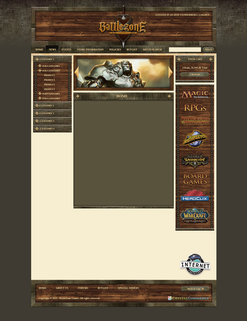
The web store was, again, a project with a very quick turn-around from design to implementation. Continuing the ‘medieval fantasy’ theme, there was quite a bit of repeating textures and the final product embraced pretty heavily skeuomorphic heavy design that was popular at the time.
Additional Thoughts
While I had a lot of opportunity to experiment with textures on the project I learned to be much less heavy-handed with them on subsequent projects using them in subtle accent roles such as the background of my current portfolio.