Black Insurance Group: Website
In May of 2020 our stakeholders at Black Insurance Group reached out about building a new website that would provide better exploration of their products, generate quote leads, and better highlight their team of agents. Since this is primarily a marketing-driven website, I began by researching both national brands and direct competitors to establish familiarity. After several iterations updating brand styles, information architecture, and wireframes I began design and development of the new website. In July 2020 we launched with an updated look, customized quote request workflows for around 20 products, custom automated emails, and refined navigation and interactivity for all of the old site content.

As with most marketing-driven homepages, page content was prioritized based on supporting the business needs while the navigation was refined to provide easy access for users. Based on both the patterns found during research and feedback from the BIG team, quotes were the top priority by far. Because of the number of products I knew would couldn’t make them all single-click. Instead, I created a custom field in the CMS to select up to 6 products that could be displayed depending on business needs and a modal with all of the products could be accessed in the secondary button below.

Because the homepage prioritized quotes at the very top, one of the design decisions I made for the product page was to allow the user to explore more about the product before providing any calls-to-action. And as one of the goals for the team was to highlight their agents I included an “expert” section locked up with the quote to provide more ways for users to get a quote. The section below supports another business goal to cross-sell between products. From a development perspective, this page template was fairly complex due to the number of sections with dynamic content which are all manageable through custom fields within the CMS.
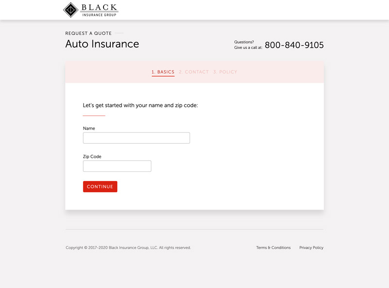
To simplify the quotes process as much as possible, the first two pages in the quotes process collect the same information while the third collects information pertinent to the policy. Furthermore, as a common UX practice I removed navigation from the page to keep distractions to a minimum. One of my major concerns as both the designer and developer of these sites is to ensure the privacy of our users. While contact information is perhaps not the most sensitive, I used session rather than local storage for my data throughout this process so it would be automatically cleared when the session was ended.
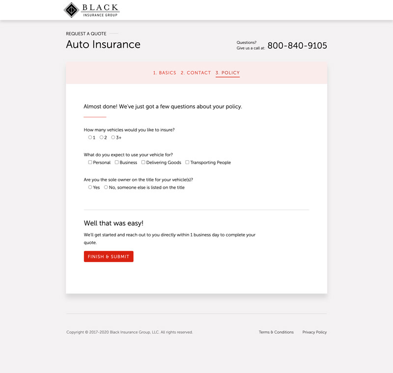
One of the business needs we needed to support during the quote process was to capture a set of minimum information about the individual policy to begin the quote. This meant each product required a different set of questions that would populate the quote process and subsequent automated email. Once completed, the user is sent to a confirmation page and a customized confirmation email is sent to the provided email address.
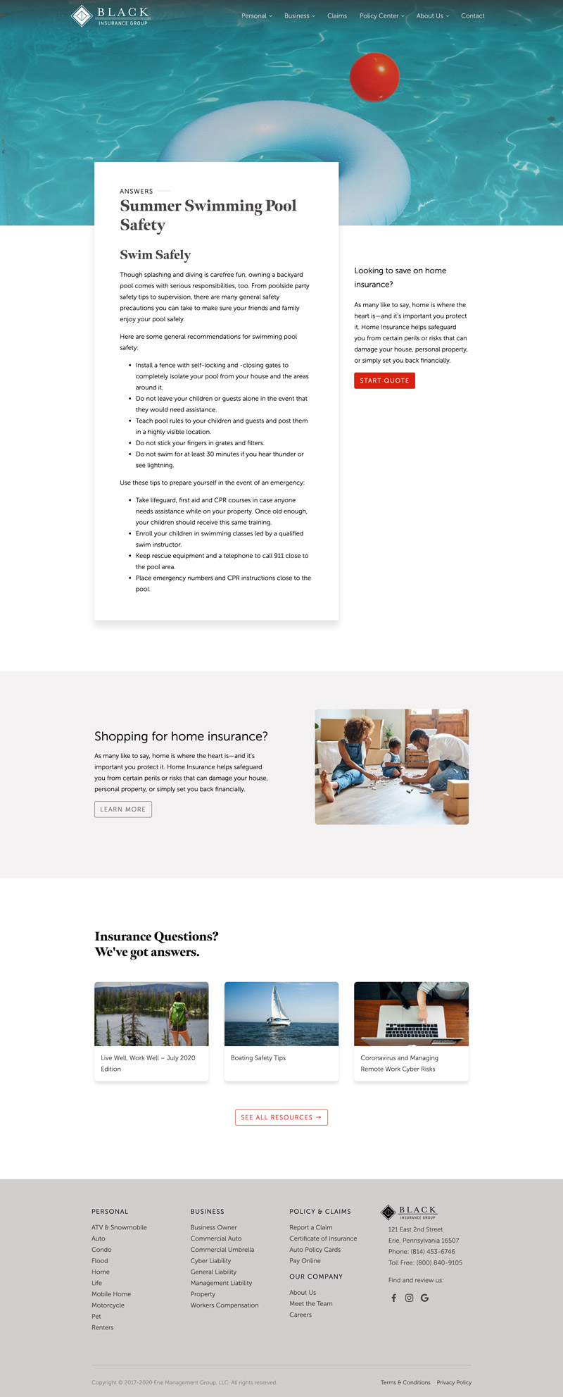
As another new addition to the website, the team at BIG asked to incorporate product-focused content on the site but we took it a step further during the design process to include calls-to-action for requesting a quote and product exploration. Development-wise, this was a really easy get as all I had to do was add a field to select an existing product to the CMS and then utilize the existing product content.
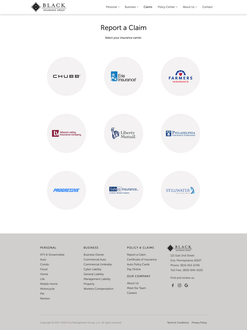
Many of the practical features that were ported over from the old website just needed small improvements to their user experience. In the case of claims, the page layout was simplified and the selectable elements were over-sized to provide a less frustrating experience for someone who may still be shaken up from an accident.
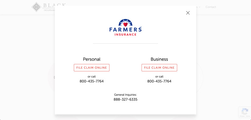
That same concept carried over to the company details where the primary actions were prominent and the text was enlarged and simplified to be functional as possible. Rather than leaving room for formatting errors, this was achieved by creating a single template with logic to optimize the front-end experience based on the contact information entered or left blank in the CMS.
Additional Thoughts
For what might appear to be a straight-forward marketing website this project had it’s share of fun challenges based primarily around the quotes process, but also in smaller doses throughout the rest of the site. As the website was content-heavy, one of the challenges unrelated to design or development was keeping everyone generating content on track. However, we were able to get it all in and launch prior to our deadline – and since launch, we’ve been able to make additions that were easily implemented through the CMS. Most importantly, we were able to implement all of the requested new features, and it was very well-received by the Black Insurance Group stakeholders.