Moz Global Navigation User Interface & Prototype
The Global Navigation project launched around the same time as our Brand Exploration project. At the time, we had a suite of products all with different navigations and despite a few band-aids put in place to drive traffic there was little cross-product navigation. It was launched and led by Courtney Davis with myself and a few others supporting with UI design, research, prototyping and testing.
In particular, I contributed most of my effort to the UI design in keeping with the brand styles that were being defined through the brand exploration as well as developing the robust 60+ page prototype in PHP, HTML, CSS, and Javascript used in multiple rounds of testing.
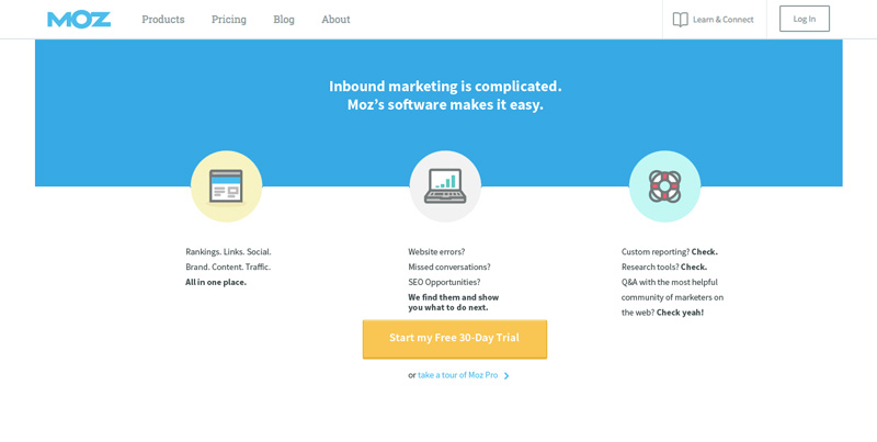
The new global navigation was a full restructuring of our information architecture and taxonomy and the team had pared it down to the most essential elements. When we began designing the user interface we collaborated to establish a clean design that would continue that intention. The marketing navigation shown was designed to guide the user through exploration prior to sign-up.
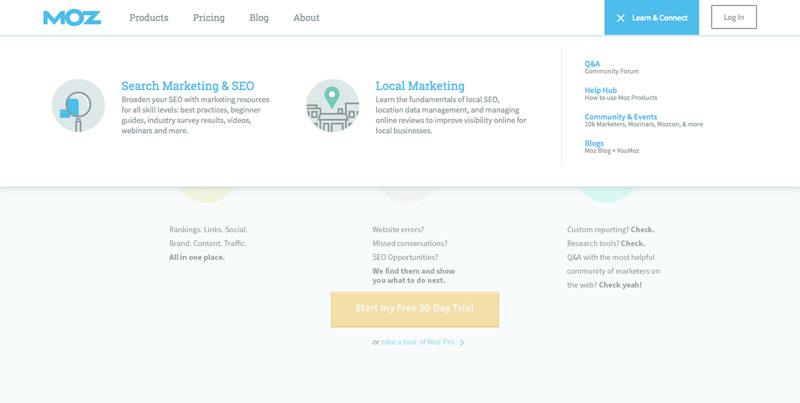
The learn and connect menu provided quick and easy access to our community and learning resources that could be rotated out as we provided new materials. This menu was eventually simplified further to direct more focus to the community. The prototype allowed for navigation from any link in the header or menus to provide as realistic an experience as possible during testing.
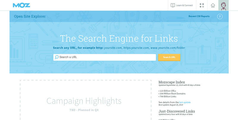
After signing in, users would be navigated into Moz products. Free users would continue to see marketing links however navigation for subscribers was be updated to reflect the new context, refocusing on the product suite and account. Prior to launch this was heavily debated by the marketing department and it was eventually changed back to persist regardless of context.
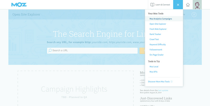
The product drop-down allowed users to access any of our products prioritizing those included in their subscription. The prototype allowed users to navigate to any of the products in the menu and even pages within the products to allow for adequate testing.
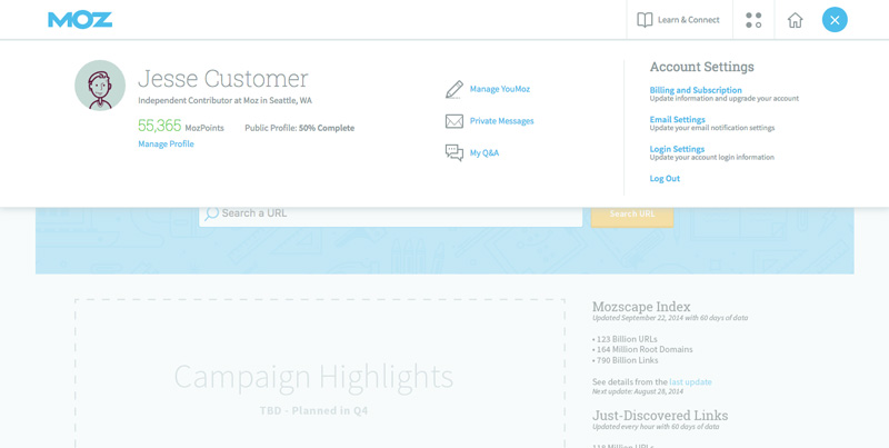
The menu for the user was accessed by clicking on their avatar and displayed their profile information as well as community links and access to their account settings.
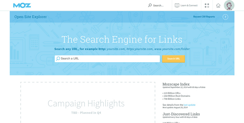
Searching the site from the header was considered secondary functionality but we still wanted to included it, so we tested only displaying it on hover. This was in part to prevent confusion when many of our product also utilized search fields. Despite decent test results people were uneasy about it internally and it was decided to display it minimally by default.

The search input was resized on focus allowing it to be condensed by default but allow for long search terms when activated.
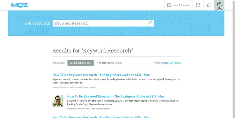
Again, since the original design displayed the search field only on hover it made for much cleaner hierarchy in search results.
Additional Thoughts
In general I prefer prototyping in code whenever possible as it allows for much more flexibility than prototyping software. That said, I’ve seen good results from prototyping software as well. I had done several prototypes while at Corbis but this was the first time I had tackled something at this scale. Thankfully, I took time up front to consider the architecture of the prototype and decided to create a system of partials and includes to maximize efficiency, especially when it came to updating. It was a challenging prototype to keep track of but well worth the work given the valuable information we were able to collect through testing.