Corbis Images: Image Pagination
One of the biggest limitations in the Corbis Images product when I started was it’s image review functionality. Looking through search results people would open up dozens of windows to view larger versions of potential images before adding them to wishlists (aka lightboxes) or downloading for comps. In an effort to help them streamline their process this project was created to identify a quick and easy way paginate through those larger sizes. To that end I provided several options for review and testing.

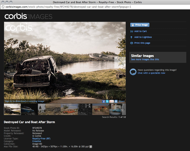
The first option I provided was akin to slideshows we often see on product pages on consumer sites. The image could be paged through one by one using the controls on the image itself or the user could page through quicker and select images using in the filmstrip below the image. In the end this was not very discoverable forced the image details too far down.

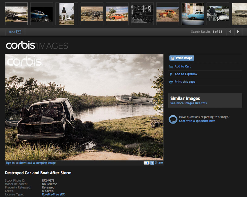
This option was the eventual winner although it’s size limited the number of results and the single pagination controls on the image were removed after further consideration. However, separating the filmstrip from the image and moving it to the top made it more discoverable and intuitive to users.

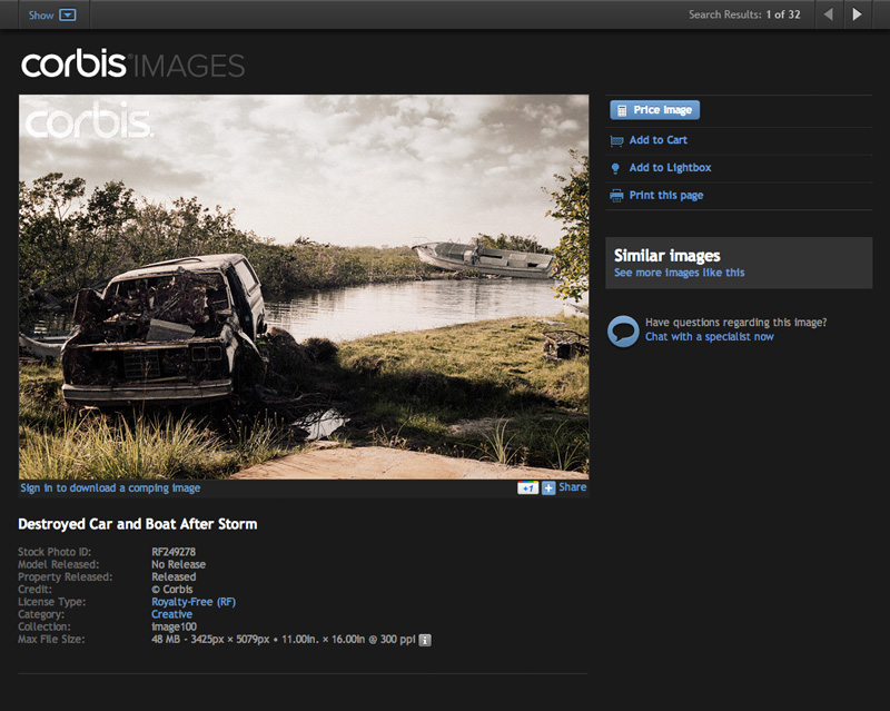
The concept of the ‘buddy’ was familiar to users as it was used elsewhere on the site although why we called it that, I’m not sure. At first this was my favorite option as it’s separate container created a clear hierarchy and in it’s collapsed state (as shown) it was really minimized. However the issue came when people opened images in a new tab rather than a popup and it conflicted with navigational hierarchy.

In it’s expanded state it provided much more area to parse through images although the controls were still limited to paginating one by one. Additional controls could have been added to paginate quicker but with the hierarchy problems addressed above, it was never explored or tested.

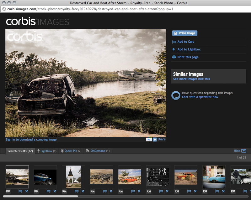
The final option I proposed was to use our existing buddy which was locked up at the bottom of the page on some sections of the site. This option added another tab to the buddy for search results providing a large area and quick access to whatever lightbox the user may be working in. This option was considered for a time but eventually lost out to the simpler and more discoverable filmstrip.
Additional Thoughts
My team at Corbis almost always encouraged us to provide multiple solutions to problems which we could then discuss and refine. As I continued growing as a designer I found myself doing this a lot more in sketches and wireframes and pairing down prior to proposing with the team. However in some instances I think proposing multiple options for discussion helped my product team feel more involved in the design process. So I’ve continued to employ the practice, just with a lot more cost-benefit consideration up front.