Veer: Registration & Authentication
When our team took on the redesign of our Veer product I was tasked with several parts of the site. One of the sections I was asked to design was the Registration and Authentication experience in part because I had been tasked with developing the workflows for an open authentication system. Up to that point Corbis had kept it’s products separated but with the new Veer they wanted to merge the two as well as allow for login with a social account. This ended up being a much bigger technical problem than expected and the team pushed Open Authentication to a later date. The final designs did not include the additional workflows but I kept them as part of the documentation for follow-up.
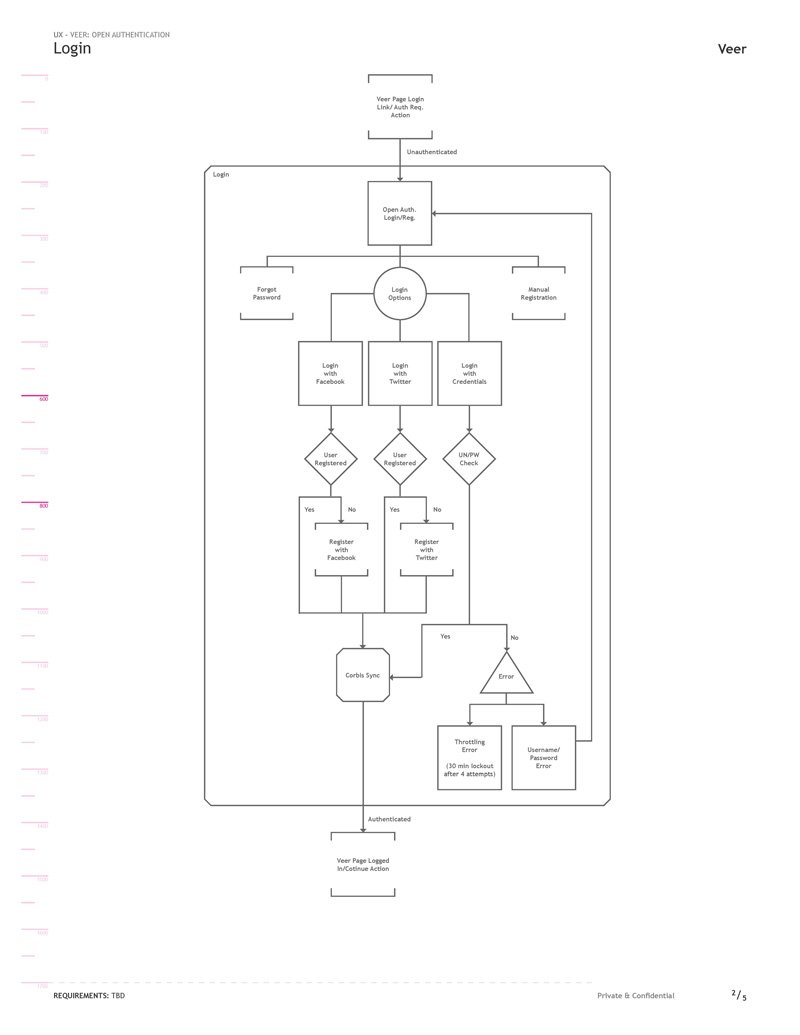
In order to fully document the complexity of the new designs I utilized Jesse James Garrett’s “Visual Vocabulary for Describing Information Architecture and Interaction Design” to develop the task diagrams. Updates to the Log In task flow were the addition of login via social accounts as well as a new verification of a non-synced account we were calling ‘Corbis Sync’.
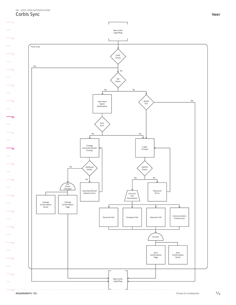
To date the accounts across our products were separate entities but with the planned adoption of Open Authentication with a single login we needed a system that allowed customers to merge them. Corbis Sync was our system for verifying and combining accounts that existed across our products. There were security concerns of course, as accounts contained sensitive information so when a match was found we required a second authentication into their matched account to merge them.
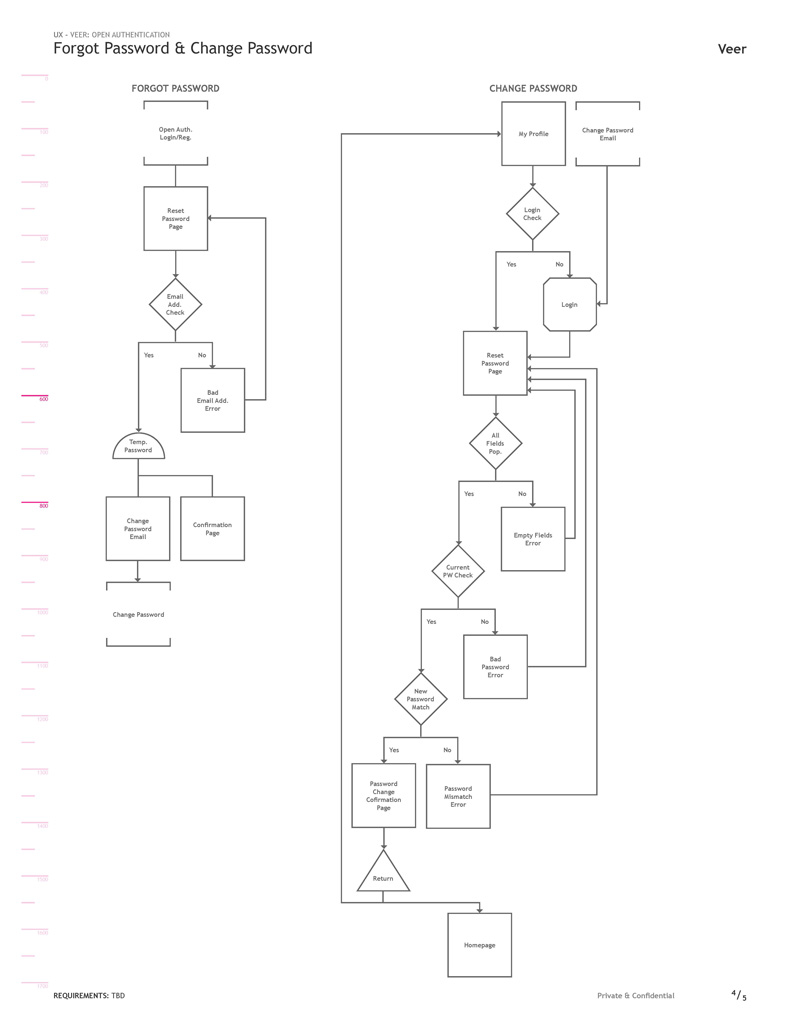
Tasks for resetting and changing the users password remained standard and familiar workflows.
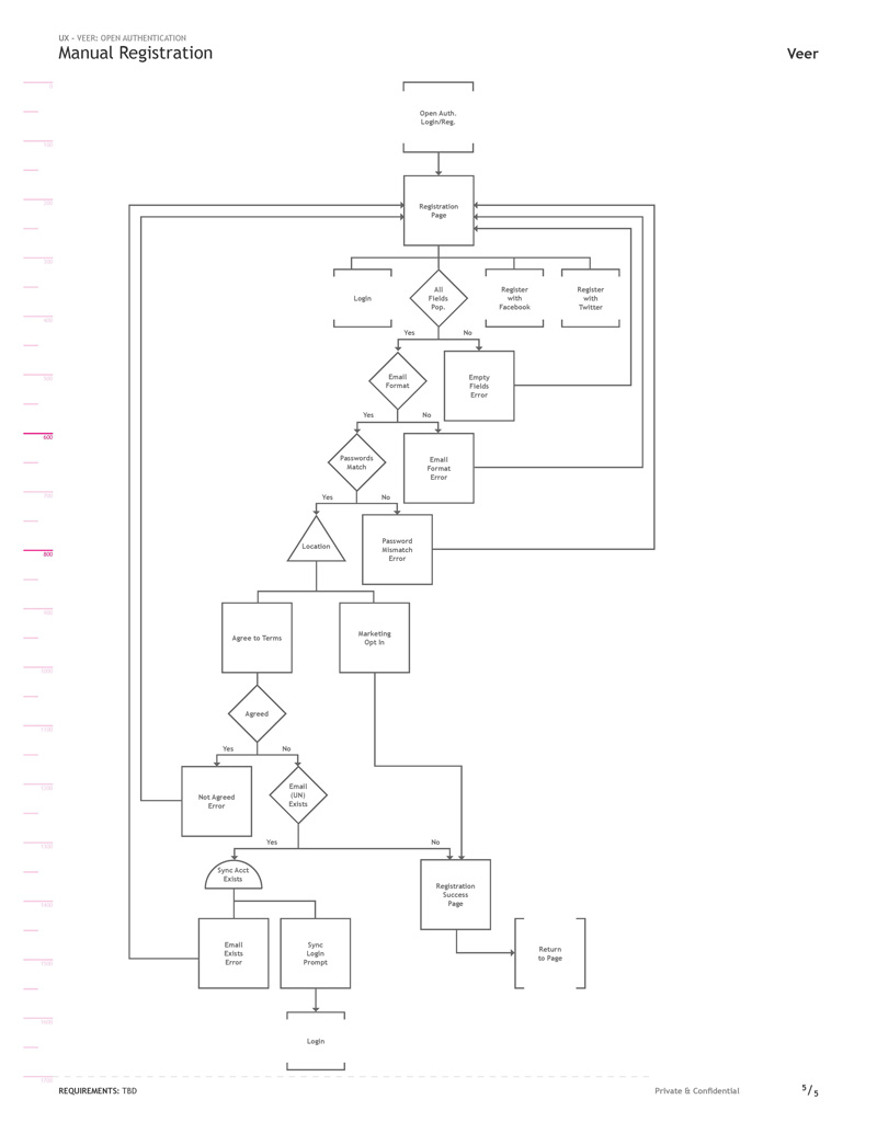
Registration was also kept familiar with the addition of options to register with a social account. Also all new user registrations were verified through our Corbis Sync system.
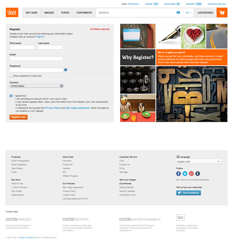
Historically Corbis registrations were more complicated, requesting additional user and company information. After researching solutions and confirming with the team, initial registration page was kept minimal to maximize the number of sign-ups. We could have forgone the first and last name fields as well but leadership had some resistance to it as part of a compromise.
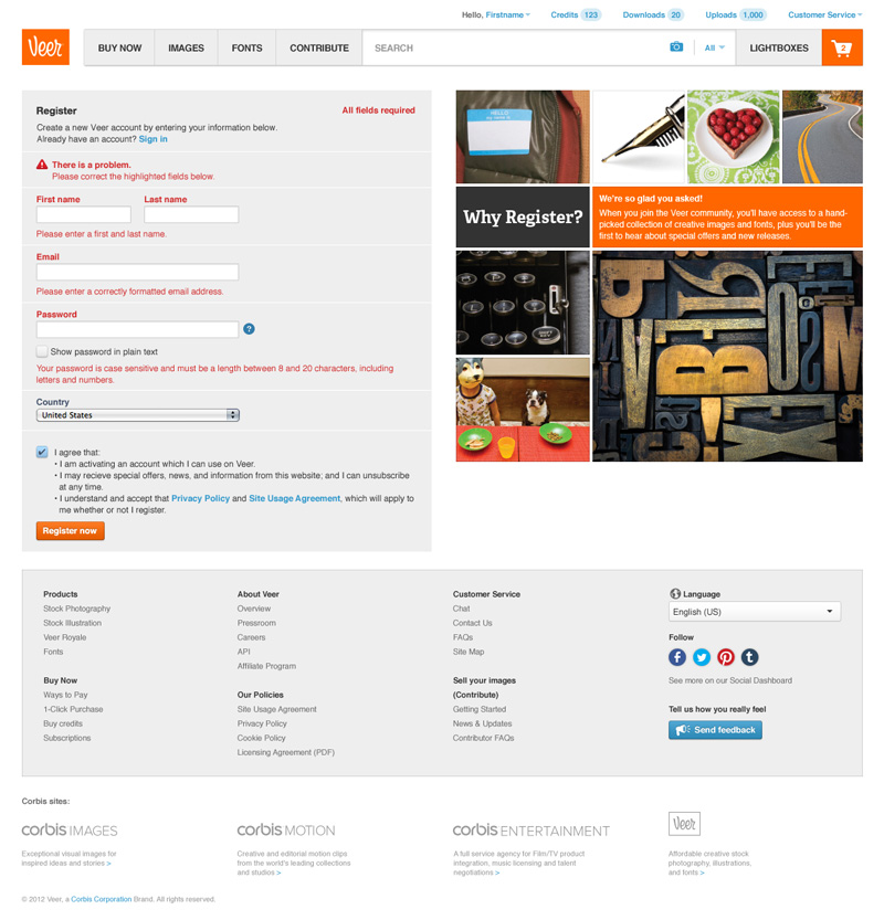
As the form was kept minimal so were errors, however all fields were required.
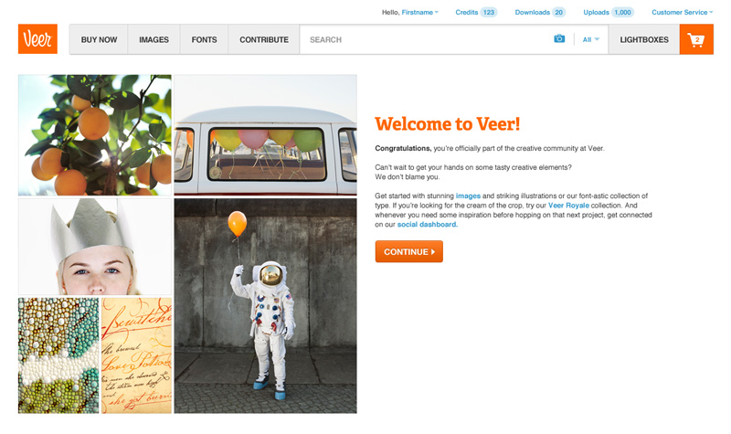
The welcome message was kept simple as well. We didn’t have a dedicated copywriter for the project so designers were left to do much of the heavy lifting. In retrospect I think I might have kept it even simpler.

The sign in page was kept really basic with very little marketing. Our intent was to simply get users through the door and into the product.
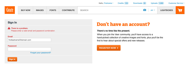
Errors on this page general for security purposes, indicating that either field could be the problem.

Clicking the ‘Forgot your password’ link took users through a very standard password reset workflow.
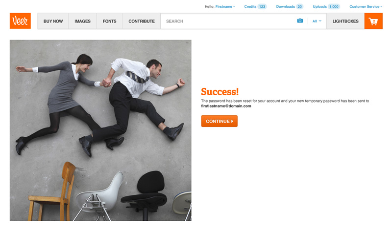
After entering a valid email address a success message displayed and the system kicked off a password reset email.
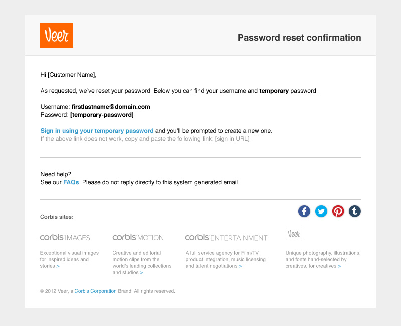
The email contained a generated temporary password and provided a link to sign in. A better practice used today would be to simply lock the account until a generated link from the email is clicked. This option creates fewer steps, less confusion and arguably better security.
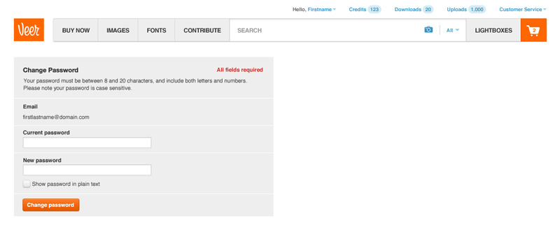
After signing in with the temporary password the user was automatically redirected to the change password page.
Additional Thoughts
Open Authentication remained a project that was talked about often but ultimately never completed. Even though it wasn’t implemented the task diagrams I created were used extensively in planning and discussions. The rest of the project employed standard practices at the time but with better options for security and experience today, I think I would take a different direction in a few places. All-in-all it was a engaging, challenging project at that point in my career.