Corbis Images: OnDemand Subscription Activation
Our OnDemand Subscription was a new offering for Corbis which sought to align with competitor offerings and improve customer retention. I was asked to design the activation experience based on existing patterns and visual language.
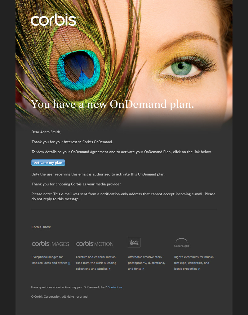
Contrary to subscription services we often see in the consumer market the OnDemand service was expensive and provided access to nearly our whole collection. This meant that applicants were vetted before activating the service and that they would begin the activation process via an email. Clicking the link would take them to the website to begin activation if the user was signed in, otherwise it would authentication first.
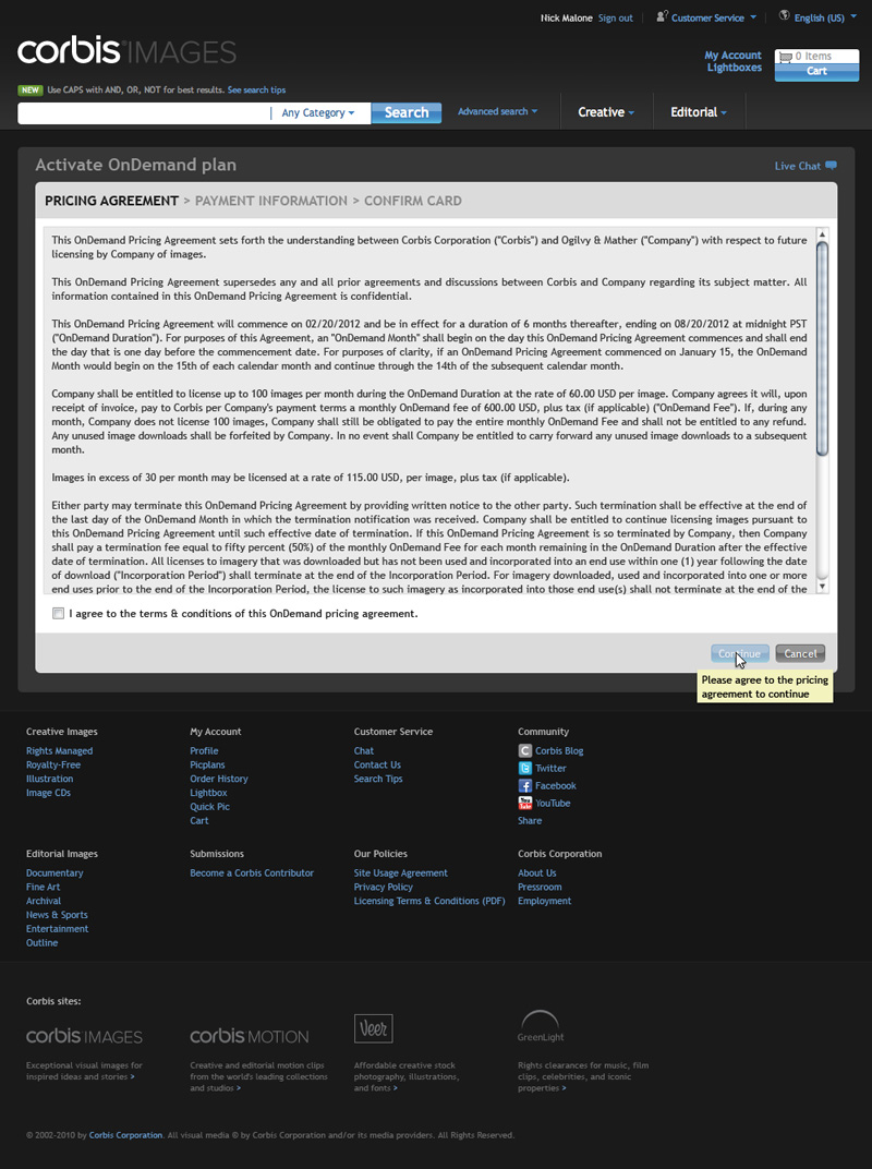
Agreeing to the Terms & Conditions of service was the required first step in the three step activation process.
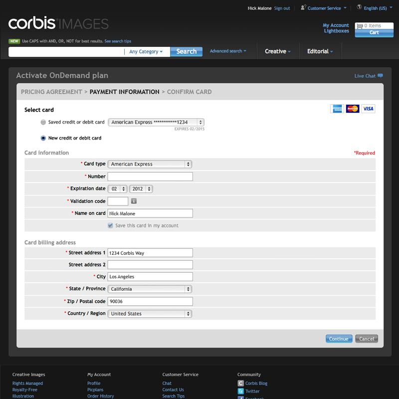
Payment information could be provided via an existing card on the account or by adding a new one.
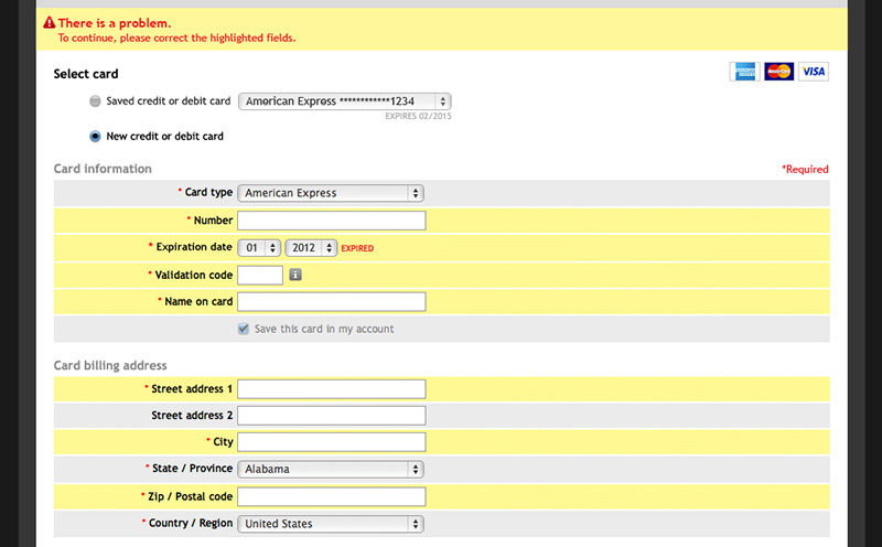
Unfortunately, error handling on credit card forms had not been well documented up to this point so addressing all errors required a bit of research into our payment processing system. A side effect of this ended up was that I built better relationships with our developers as I had to work closely with them interpreting the error codes.
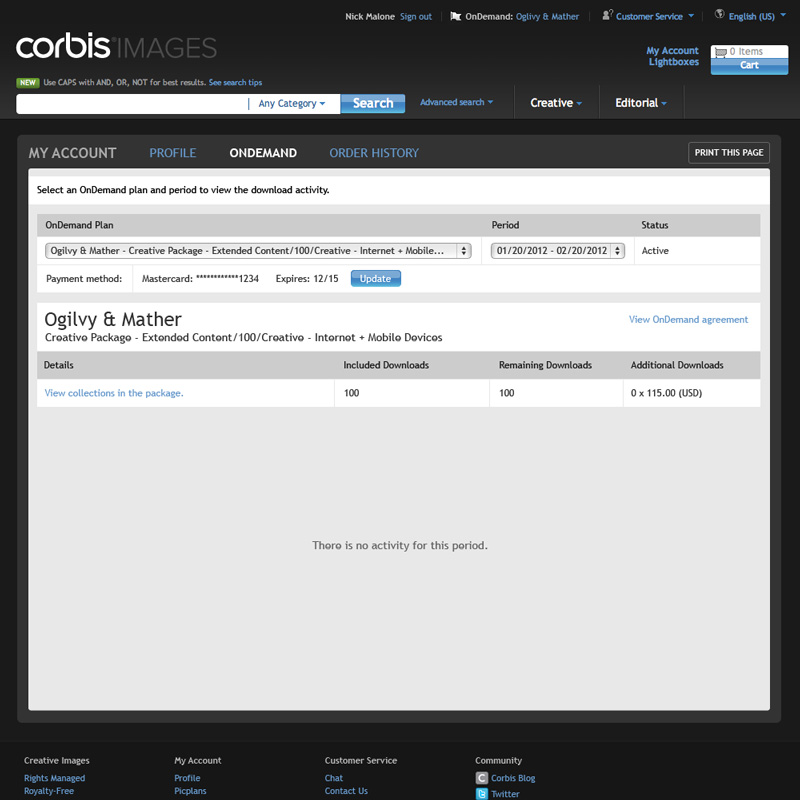
Displaying the dashboard after activation educated them on where to access to update payment information, review their agreement and track activity.
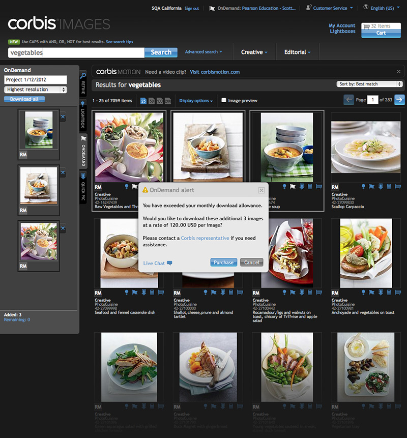
If the user exceeded the number of images they were allotted in a month they paid a flat rate included as part of the plan for the extra images. This was not a surprise for most users but I wanted to prevent them from accidentally racking up large bills and suggested this modal be added.
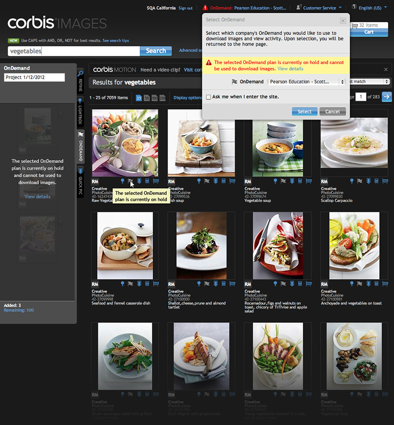
Many users worked for agencies and worked with multiple subscriptions so we needed to provide context. This was displayed at the top of the header and allowed users to switch between them via a modal layer. This made an ideal place to notify the user if the plan had been deactivated or placed on hold.
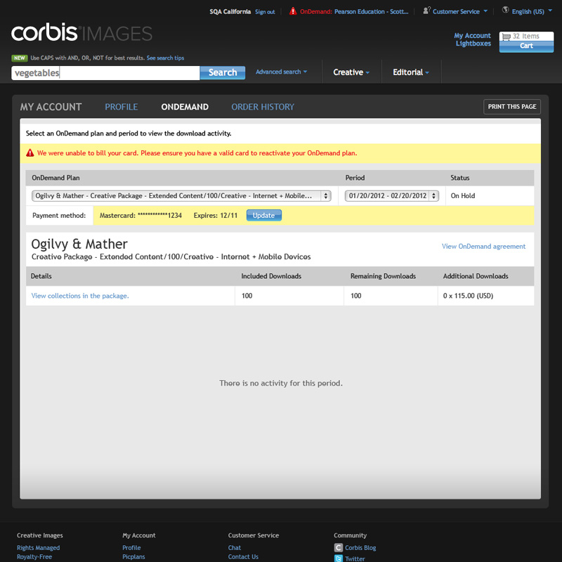
Dashboard error messaging provided more context as to why the plan was placed on hold and allowed them to correct the issue.
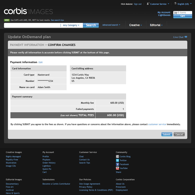
Updating the payment information reactivates the account and allows them to resume service immediately.
Additional Thoughts
This was yet another basic project that simply needed to get done to launch the product. Although I didn’t expect to, I learned quite a bit regarding payment processing and more than that this project helped me build better relationships with our developers which I was really grateful for.