Moz Brand Exploration
I should start by saying that this project was entirely a team project and that while I contributed in various capacities my main focus was to organize, facilitate, and communicate. This project started after I was asked to redesign one of our products and promptly proceeded to flop. To give some context, we had up to this point designed each project in a relative vacuum pulling very little design language from product to product. I decided to change that with the supposed redesign and my first stab at it was something I put together with minimal planning or analysis. Surprise, surprise it did not go very well. After some discussion with leadership and teammates it was decided we were going to take a stab at solving the problem together.
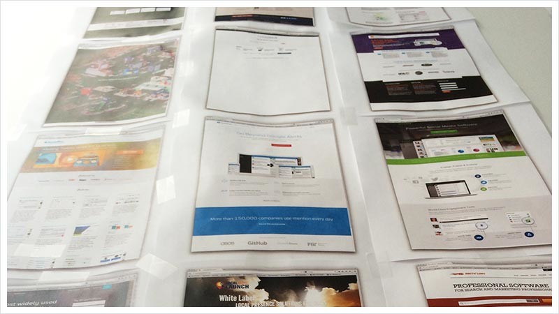
The first thing we did after putting together a plan for the project was to contact our Business Intelligence team and get a full list of our competitors and affinity products to get a healthy understanding of the market and where there were opportunities to differentiate ourselves. In the end, this did little for the project except to validate that we had weren’t stepping on anyone else’s toes with the end product of the exploration. That said, we learned a lot about our industry that was certainly not a bad thing.
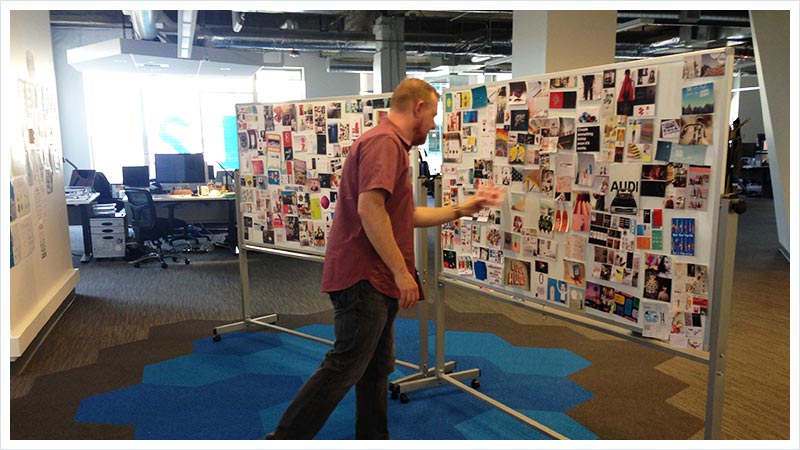
Next, we wanted to understand what people saw as ‘Mozzy’ or within the Moz Brand. To that end we created walls of imagery, fonts, colors, and products that captured a full spectrum of aesthetics. We then had the individual pull from the walls to create their own ‘Mozzy’ mood board and asked them to share their thoughts out loud as they went while someone from our team recorded any descriptive keywords or phrases they used.
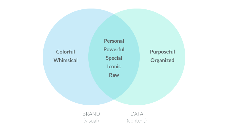
In one of our next team meetings we took time to review and analyze the results to identify commonly used keywords and phrases. During the meeting we developed a detailed word cloud that we then distilled into seven major positive concepts people associated with our brand. Once we had the major concepts we identified them as either visual, data-oriented, or both.
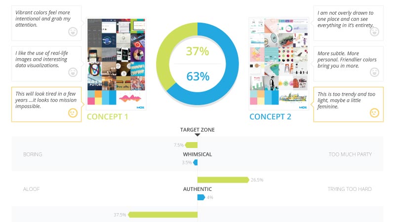
In addition to capturing brand concepts we documented the mood boards people created. From that teammates assembled 2 curated mood boards with distinctly different feels that we felt both aligned with the Moz brand. During Mozcon — our annual SEO conference — we asked attendees to review both mood boards being sure to cross demographics and alternate which mood board they saw first, asking questions regarding our brand concepts. In the end, we had positive results on both sides but more importantly a clear winner. After collating the results I pulled them together into a results sheet to share within the company.
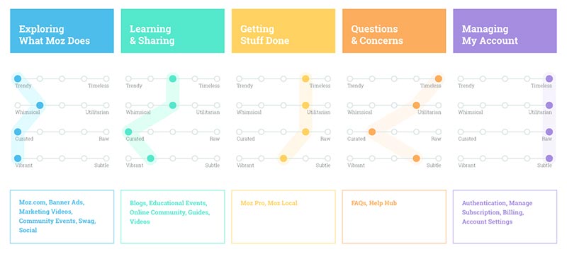
After reviewing the results we had the opportunity to sit down with one of the executives. While talking about next steps he brought up the idea of creating a structure around when and how we use these branding elements. For instance, illustrations were perfectly reasonable to use in a marketing mailer but clearly were not appropriate in an email regarding potential fraud on someones account. After some additional ideating we put together a strategy that I distilled into what we called our ‘Brand Spectrum’. This very simple set of guidelines marked the first fruit of our labor and became a really useful tool in defining the visual language and verbal tone for future projects.
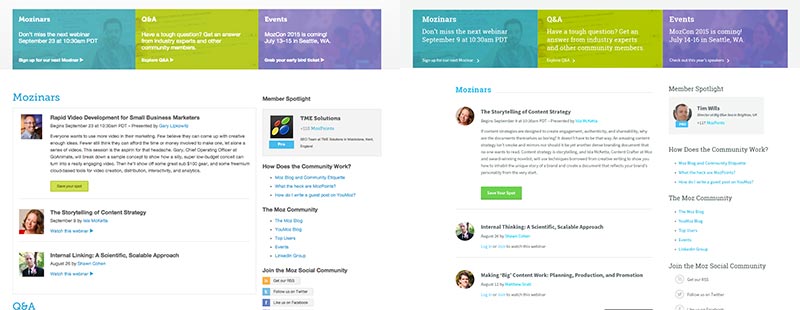
The goal for the project was to pull together an updated UI Pattern Library which would could use to unify the design language used in our products, but before we went for it we wanted to validate that we were headed in the right direction. To that end we put together a first draft of several of the patterns and updated screenshots of existing page with the new UI. We then took the updated screenshots along with screenshots of existing pages and some from competitors and affinity products and paired them to test their consistency. From the test we learned that the updates were minimally disruptive and fit well within the brand concepts we defined earlier on. More importantly, people identified the Moz brand more consistently with the updated UI.
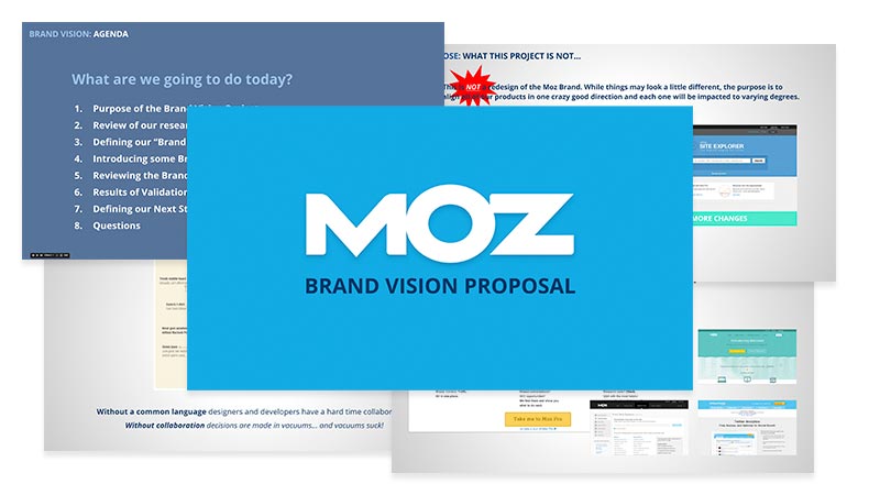
Finally, equipped with the results of our testing, the Brand Spectrum guidelines and a first draft of our UI Patterns myself, along with a couple of teammates shared the findings of the project in a proposal to our executives. After a number of questions and snippets of feedback we had the go ahead to begin implementation of our new Brand Vision. Shortly thereafter I began work on Moz’s Pattern Library within a couple of months several product teams had begun iterative implementation of the updates.
Additional Thoughts
Testing and measuring the results of something as nuanced and subjective as brand aesthetic is really difficult. It would be misleading to give the impression that we had hard scientific evidence and we tried to be as transparent about that as possible. However, we did our best to use every opportunity we had to collect both qualitative and quantitative data to inform our decisions. One of the most surprising outcomes of the project was that this had a really big impact on peoples perception of our team. In the end we had not only identified a vision for our brand but also earned some trust within the company.