Moz UX Team Site
The UX Team Site was a really fun and challenging project as I both a lot of freedom and autonomy but I also had a lot of feedback and scrutiny from fellow designers. The design for the project stretched back to my early days with Moz but due to company politics and higher priorities. Thankfully though, we were able to get the go-ahead in mid 2015 and I was able to work on it whenever there was a lull in my day-to-day workload. Design certainly wasn’t done in a vacuum as I facilitated a number of initial and review meetings to gather ideas, requirements, and feedback from the greater team. A fully responsive MVP of the site was launched in early 2016 with plans of launching the public, interactive pattern library later in the year.
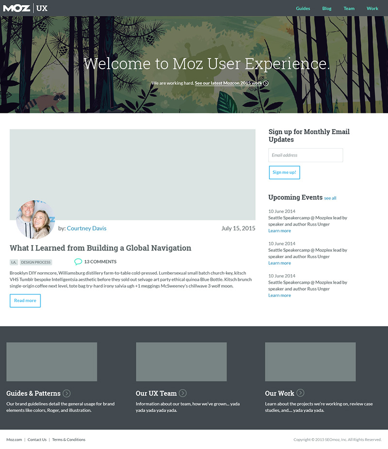
The home page of the site was focused on the most recent content. The hero for the page was both a welcome and a call-to-action to view our most recent case study. An excerpt from the latest article was held was next in line followed by upcoming events. One of the decisions we made prior to launch was to leave off was the email sign-up. While we wanted engagement we decided it would be better to focus on content first and foremost and perhaps add that later, once we had some momentum.
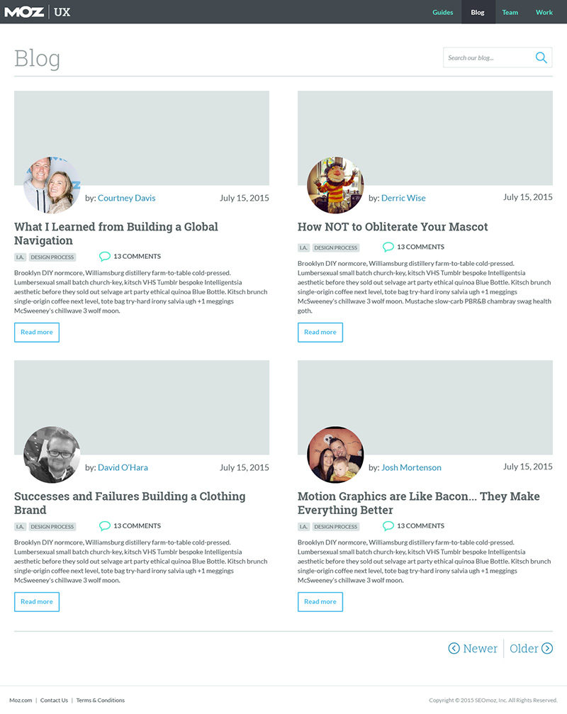
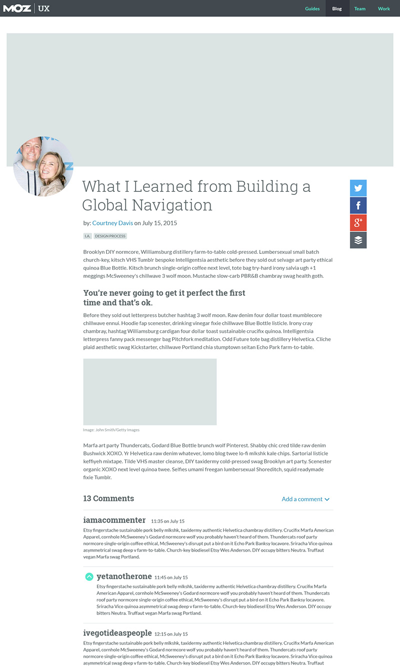
Again the lockup for the articles were an opportunity to create some brand familiarity so we decided to keep them pretty similar to the community site. In the end I think the design was pretty elegant and has continued to hold up both functionally and aesthetically.
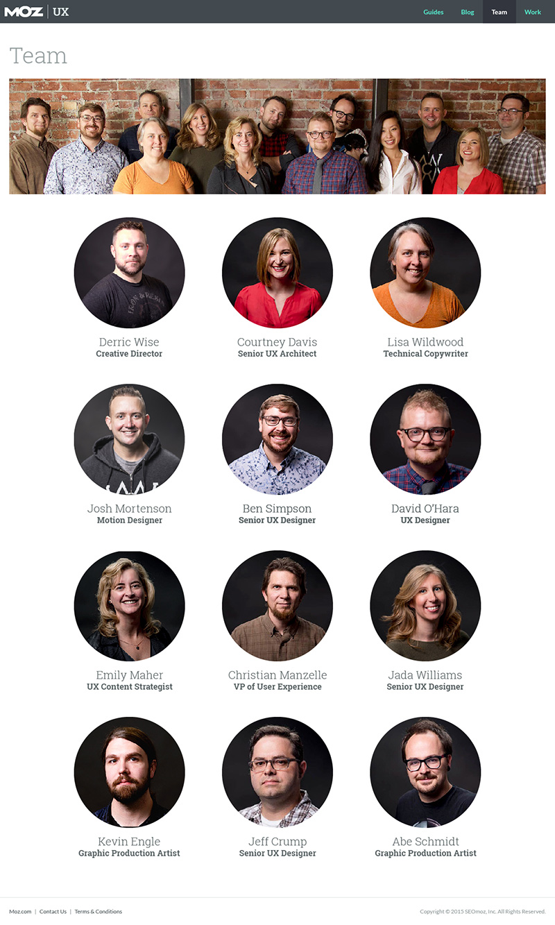
The Team pages were part of the project from the very beginning. This was of course an opportunity to be expressive but it also gave us a chance to lift one another up as individuals.
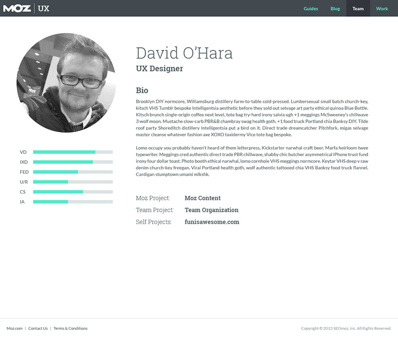
While the final product launched almost exactly as shown, we decided shortly after launch to remove the ‘stats’ section as it poorly represented competency and skill of our specialized teammates.
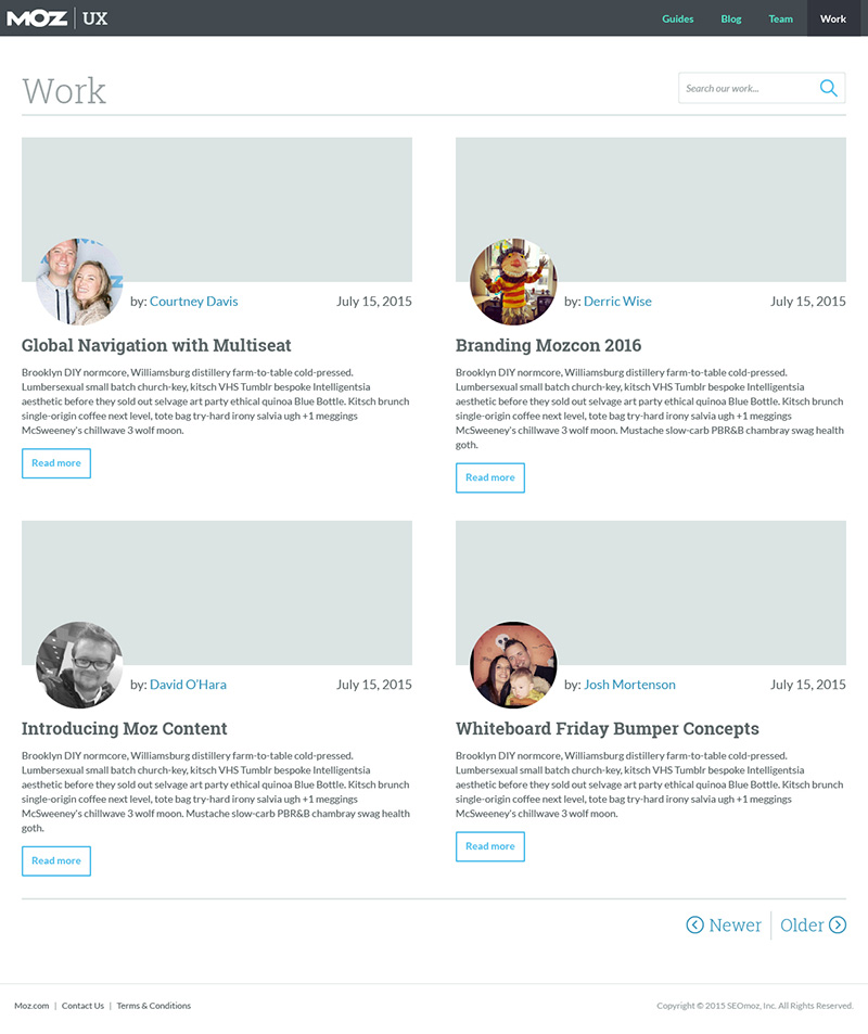
This page was where we intended on putting all of our bigger projects as case studies. Case studies, as opposed to regular articles, were long-form posts focused on a larger project sharing the knowledge and information we gained along the way. As you can see in the screenshot, the categories and comments were removed for brevity. As with the Blog Landing Page we displayed 10 posts per page along and the search bar was moved to the header.
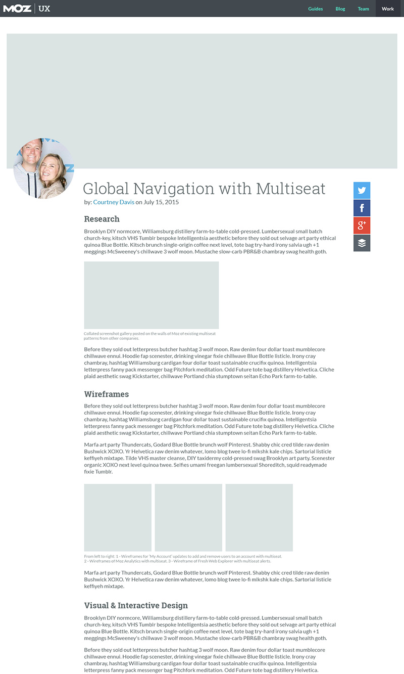
Individual case studies were fairly large posts which initially we though could pose some issues with load times due to the volume of content and images. However, by the time the MVP was finished though we realized the site was pretty light on it’s feet and with optimized images the case studies loaded within a reasonable amount of time.
Additional Thoughts
This project was by no means the most exciting project I’ve worked on design-wise. However the freedom and opportunity it gave our team was absolutely worth it. While this was not my first ‘scratch made’ WordPress theme it was fun and educational nonetheless. I learned quite a bit in the role of ‘developer’ from this project that I hadn’t prior, and even in the few WordPress development projects I’ve worked on since I’ve learned a lot more. I think one of the things I really enjoy about mixing development, prototyping, and designing into my day-to-day is that it has continued to provide better perspective and expectations in working with others in those roles.