Moz Analytics: Dashboard
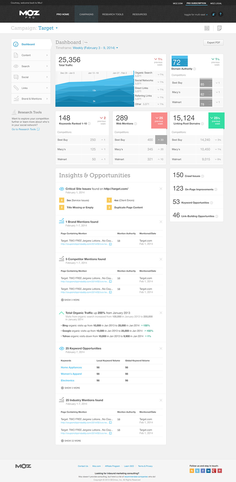
Redesigning the Moz Analytics dashboard was one of my earliest projects at Moz. Just before I had started, the product had gone through a rather difficult and drastic redesign and the dashboard was not meeting the customers needs. The specific feedback was that it was confusing, it was hard to navigate, and it didn’t include some of the high-level data people wanted to see. In addition, the product owner had been experimenting with ways to provide valuable, actionable insights to customers and Insights & Opportunities was added to the updates. While I lead the design efforts for it, several teammates were instrumental in making it happen, providing much needed feedback and assisting with testing prior and after launch.

The first thing we focused on as a team was identifying a clearer hierarchy for the page. After some discussion it was clear that site traffic provided the most value and after experimenting with several graph types and iterations the monochromatic stacked area graph provided the clearest data visualization. To support the hierarchy further, it was decided to pare down all other visualizations and focus on the highest value information displayed as simply as possible.
Change over time for that data was still important, so I designed a simple card layout which included that information at the top and in cases of large changes up or down highlighted it. Finally, the new Insights & Opportunities panel was planned to include any number of insights with varying types and priority and each type needed to be implemented with clarity and consistency in mind.
Additional Thoughts
This project went through a lot of review and refinement. As it was the highest traffic page of our flagship product there were a lot of stakeholders and a lot of feedback to consider. In final user testing it was met with mixed results and even with updates the public release was met with similar feedback. The page as a whole was much improved however the Insights & Opportunities didn’t provide as much value or engagement as we had hoped. We thought at first that it may be due in part to the design but even after some additional updates there wasn’t much engagement.
I think I learned (again) that not every problem is a design problem to be solved, especially from a purely user experience perspective. Often enough it can be the substance of the thing itself. That might seem like a pretty obvious conclusion in hindsight but reminding myself that I can’t or won’t have a solution for every problem is something I’ve had to continue to do.