Moz Keyword Explorer
Keyword explorer was a pretty important project for me in that it was my first completely new product where I was the dedicated lead designer prior to inception. It was a challenging project as well. This was in part because of the problems we were trying to solve but also due to internal politics which, while difficult to navigate at the time, became an incredible learning experience in dealing with conflicting personality. Ultimately, it was a great product with a great team and seeing it launch was a proud moment for everyone involved.
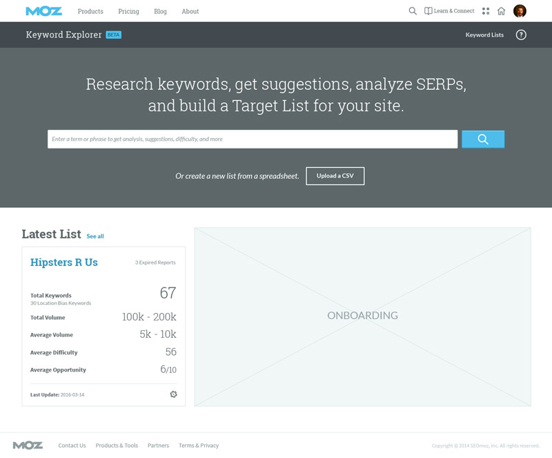
After a lot of iteration the landing page for the product was intentionally left simple and focused leading with the core tasks of the product. At the top was a simple search bar to get users in and analyzing keyword terms and phrases. Secondarily, people could access a previous list to continue some previous work. Tertiary functions included importing a CSV of a previously compiled list or accessing all of the users previous created lists.
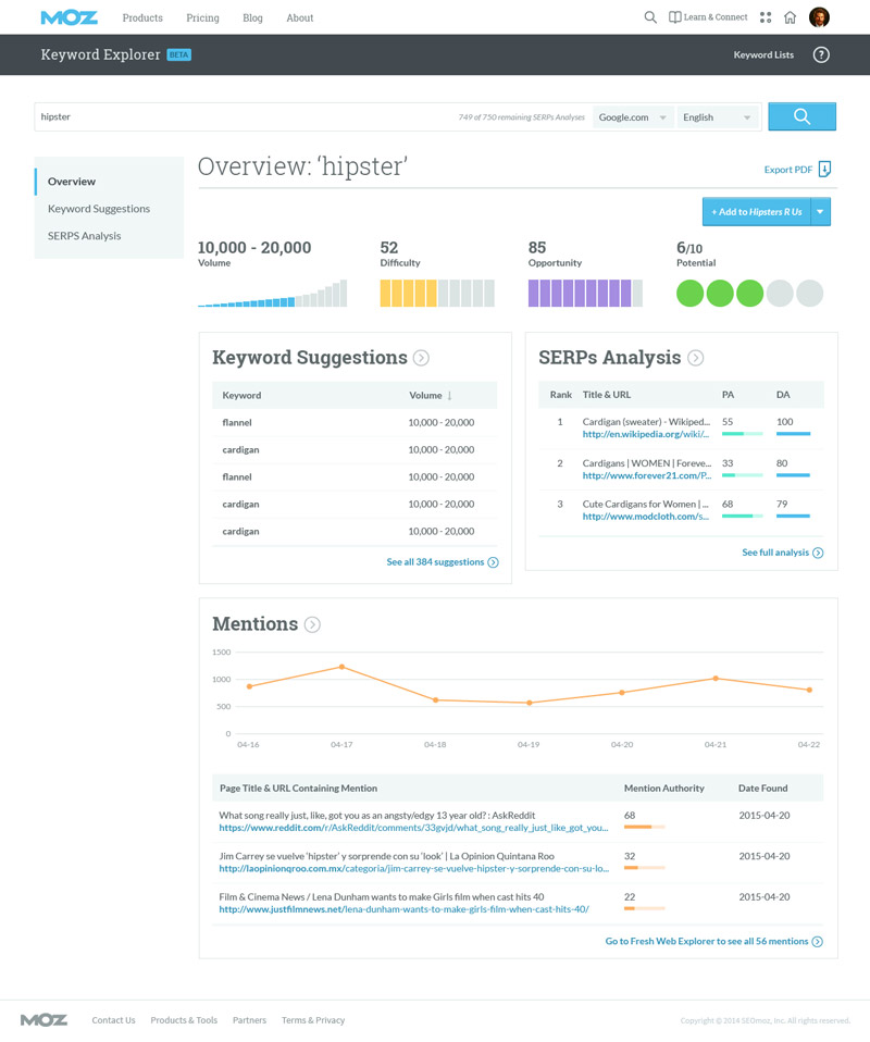
Most peoples initial interaction with the tool is searching a keyword term or phrase which brings them to this page. Its function is to provide high level information on the keyword, actions such as adding the keyword to a list and contextual navigation to further investigate the keyword term or phrase.

The SERPs report is a sort of annotated version of the first page of search results for the selected search engine and language. As you may expect, this report expires within days as actual results are relatively fluid. To handle this there is addition notification to warn the user the data will soon or already has expired, as well as actions to refresh the report. An alternative we explored was to simply update the report automatically but this proved taxing at scale.
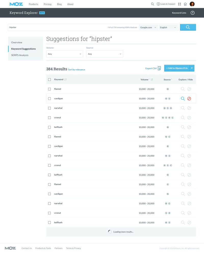
Like many products, Keyword Explorer started from a pretty simple idea and this page is it. While working on other products the team had investigated avenues for suggesting optional keywords as a way of helping our customers identify and optimize for less competitive more valuable keywords. During the investigation they found several sources which yielded surprisingly accurate results and this became the foundation of the tool. Put simply, this page takes assembling lists of potential keywords, a very time-consuming process with traditional tools, and makes it very quick and painless with great results.
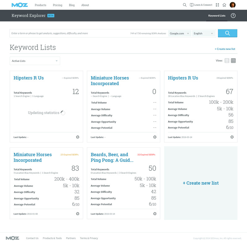
Keyword lists are not at all a new concept but for most industry professionals they sit in spreadsheets that require constant upkeep. This page allows users to monitor their lists and update as necessary, again making a day-to-day task much less cumbersome. This page also allows users to archive lists to prevent clutter without losing access to them altogether. The page defaults to card view until either the user selects list view or reaches a certain number which makes the list view more navigatable.
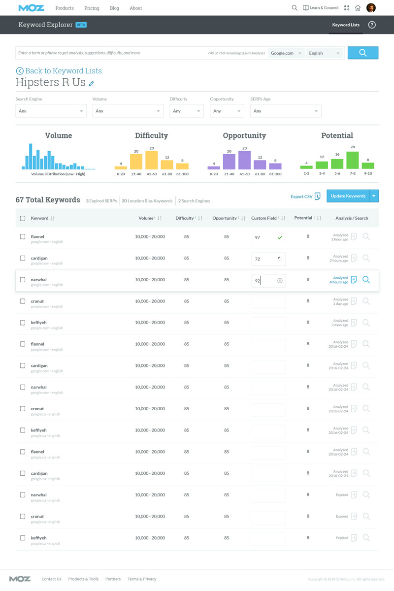
Keyword lists are an important part of many SEO professionals days and as their is no industry standard everyone has their own unique way of organizing them, making the design and implementation of this page really challenging. In the end experts and user research helped us identify the most important data points as well as confirming the need for a ‘custom value’ column to allow users to input their own score. This was really the first product we began defining a simplified design language for data visualizations as their number and density made it imperative to simplify as much as possible.
Additional Thoughts
This project included much more functionality than what I covered above: import functionality, errors, limits, search history, and a lot of nuanced interactions that rounded out the product. Some of this is additional work is available in the PDF below, however I’ve left out much of the repetitive notifications and alternate functionality. If I could go back and had carte blanche to design the product differently there are of course some changes and refinements I would love to make. That said, as designers we are often working within the boundaries of a minimum viable product, politics, due dates and limitations. Considering all of that I couldn’t have been happier with the product our team put together.